8 Visual Design
While writing has perhaps always involved some form of visual design (after all, writing itself is a visual representation of language), design has become increasingly important in the modern age. Contemporary writers will almost always be faced with design choices, whether they are as simple as shaping the written page or as complex as creating something like an infographic that involves heavy use of both written text and visual elements. There are two major categories of design that writers should be familiar with: document design and visual design. This chapter will go over both of these, as well as visual rhetoric and visual analysis.
Document Design
As mentioned previously, when you are tasked with a writing assignment, some elements of its design may be specified by the assignment instructions or the conventions of the writing genre. Understanding your assignment and knowing genre conventions gives you a basic set of ideas for what a document should look like, but many decisions remain as you work to design a document that is both:
- Visually appealing
- Easy to read
A document’s overall appearance affects the reader’s attitude toward it and determines whether the reader can find and engage with the information that they need simply and effectively. Your audience will read your work for a variety of reasons – some may read deeply, and some may scan for specific information. Good design ensures that the document is easy to read, which contributes to its overall effectiveness.
The design of your document will be based on your audience and purpose. Once you’ve determined those, you can use the following guidelines to design your document. You should make these decisions in the planning stage, before writing, because what you write may be informed by the format. For instance, you may need to write more or less because of the space you have on the page.
With all of that in mind, you will need to make choices regarding the following elements:
- Shaping the appearance of the page
- Styling words through typographic elements
- Crafting access to information
- Adding other design features.
Below is an example of a document design workflow. Once you have made these choices, it is important to stick to them and use them consistently – consistency is absolutely rule one of document design.
- Shaping the Page
- Margins
- White Space
- Grids
- Styling Words
- Fonts
- Sizes
- Emphasis
- Capitalization
- Accessing Information
- Headings
- Lists
- Adding Other Features
- Visuals
- Text Boxes
- Borders
- Lines
- Headers
- Footers
Shaping the Page
Shaping the page includes three primary factors: margins, white space, and grids. Here, we will focus on margins and white space, as grids aren’t of particular importance for composition.
Margins
Most publishing software and word processing programs, like Microsoft Word or Google Docs, automatically set default margins. For class purposes, these defaults usually align with instructor preferences – 1” margins are both the default and the common requirement. However, it is important to consider whether the default margins are the best design choice for your documents. You need to be sure you have left ample room around your page to accommodate issues like binding and display conditions.
You will select your margin space based on your audience, purpose, and final delivery. For instance, if your document will be printed and bound on the left side, you should actually leave a margin of at least 1 ½ inches on the left side to allow room for binding. You will need to ask for guidelines if you aren’t certain how much space to leave or how your writing will be circulated.
Margin decisions also include the use of justified or unjustified text. Justification refers to the alignment of text along the left and right sides of the margin. Most of this book is left justified: the text aligns on the left, and the type edge is ragged on the right. This will be the most commonly used justification. However, if you spotted something different about this paragraph, you have a good eye: this paragraph is formatted using full justification: the text is aligned on both the left and right sides. Full justification is commonly used in books and other formal documents and materials. Like margins, ask for guidelines and consider how your document will be circulated. Also, consider the writing itself – full justification sometimes leaves odd spacing in the writing to stretch the type to align on each side.
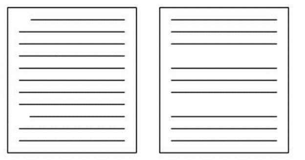
White Space
White space is one of the most important features of document design – and, really, of any design. White space is all the empty “white” space not filled by words, images, or other visual elements. Keep in mind that it’s not always white, depending on your layout – so it’s sometimes also referred to as negative space. Ask any graphic designer and they will tell you that white or negative space is crucial to their work. This is because it gives designs shape – in a document it provides a way to separate parts of the document, which is invaluable for the reader. White space can do three very important things:
- Provide a break for the reader’s eye
- Keep elements together
- Isolate or emphasize important elements
To understand the significance of white space, imagine text on a page as noise – voices reading the words on the page.
White space provides your reader with a quiet space to take a break from the visual noise of the text and the mental noise of information.
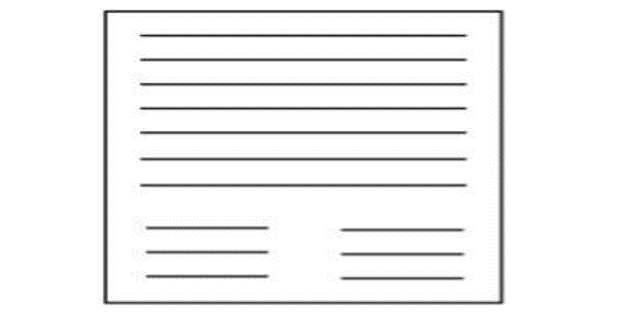
These spaces allow the reader to pause for a moment to process what you’ve told them and to get ready to move forward before re-entering your text.
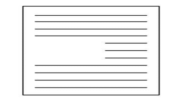
As with any rest, the reader returns to your work just a little more focused and receptive to the document. If you’ve ever experienced mental fatigue looking at a page of solid text with no breaks, then you can imagine how white space helps the reader.
Styling Words
You should consider typographic choices to make your documents easier to read. Typographic choices also help guide the reader through the document. There are four considerations for typographic choices:
- Typefaces
- Sizes
- Emphasis
- Capitalization
Typefaces
All typefaces are divided into two major types: Serif or Sans Serif.
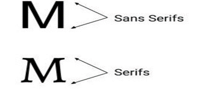
Serif fonts have little “tails” or “feet” on the letters, while sans (meaning “without”) serif fonts do not have these. Here are some samples:
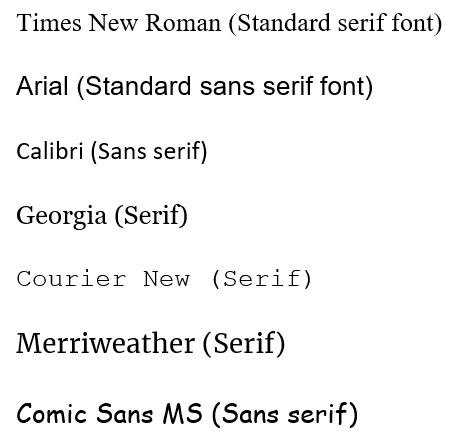
In most print documents, headings are formatted in a sans serif font and body text is formatted in a serif font. For documents that will be read online, all text tends to be sans serif. Keep in mind that readers become habituated to conventional fonts that they have seen over and over again. This familiarity can be good if you don’t want to call attention to your design choices, or want your reader to think you are doing things “by the book.” In other words, sometimes you want your reader to be focused on your content and not forming opinions based on your design choices. Conversely, a change in typeface mid-document will draw a great deal of attention. This could be negative – for instance, students often copy and paste something and then forget to change the font to be consistent with the rest of the document, and that can be a red flag for a number of reasons. However, changing fonts can also be useful if you want to draw attention to a heading or an important piece of information.
Keep in mind, too, that while they may seem perfunctory at first, fonts convey mood and tone. The mood and tone then conveys emotion, even if subtly so. As you pick fonts, make sure that the voice you choose to speak your words is appropriate for your rhetorical situation.
Sizes
This text is written in 11 point font. Body text is usually 12 or 10 point. Headings size will vary, but consider that you will often have multiple heading levels and no heading level should be smaller than your body text. Also, headings need to be readily spotted by your audience. As you think about size, try to aim for your headings to be somewhere between obnoxiously large and insignificantly small. Each heading should be easily seen, but not disruptive. Here are some examples:
12 pt Body Text
20 pt Heading 2 or 3
30 pt Big Heading 1
42 pt Title
Emphasis
Typographic highlights for emphasis that you can use include bold, italics, color, or underline. Some conventional uses of emphasis include bold for important phrases (as seen in this book), or italics for special terms (as seen when using Greek or Latin words in this book, like ethos, pathos, and logos). However, use these forms of emphases sparingly. Overuse can result in a loss of effectiveness when the reader sees it so often that it no longer seems emphatic. Overused emphasis can also be distracting, causing the reader to focus on the type more than the information.
If you do use emphasis, remember that you need to be consistent with the use of emphasis throughout your document. If you bold an important keyword in one section, make sure you bold it throughout.
Capitalization
Capitalization is another way to add emphasis, BUT YOU NEED TO BE CAREFUL. Sentences or long passages in full capital letters are difficult to read, and also give your readers the impression that you are yelling at them. YOU can use all capital leaders for emphasis to highlight a word or short phrase. For single word headings, capitals may also be considered. As with other forms of emphasis, use capitals very carefully.
Of course, you may need to capitalize things like acronyms and proper nouns. As with everything else, be sure you do so consistently.
Accessing Information
Readers need to be able to simply and efficiently access the information you’ve written in your document. Two of the most effective ways for readers to access information is by incorporating headings and lists into your writing. These both function as a way to organize information and as a design feature. Headings and lists are textual elements that communicate information, but they are also visual elements that draw the eye and break up the page into readable portions of information. Headings and lists also serve as visual cues that tell the audience what type of information is coming up.
Headings
Headings serve as a roadmap of your document – often literally, as they form the basis of the table of contents, if you have one. Following the map laid out by headers should provide readers with reliable access to different types of information. Thus, headings are one of the most important design elements for writers to consider.
To illustrate this claim, imagine a 50-page report. Hold it in your hands. Open it up and flip through it. It has no headings. Not one. Just 50 solid pages of text, tables, and graphs. Close that right up. You likely would have a difficult time finding your way through that report, correct?
Pro Tip
How to Use Headings Effectively:
- Decide on levels of headings
- Match size of headings to importance
- Avoid using more than four levels of headings
- Make headings as specific as possible
- Aim for descriptive headings, rather than generic ones like “Section 1” or “Part 2”
- Write parallel headings
- “Parallel” means that all of your headings have identical grammatical form. For instance, all of your headings might start with a verb.
- Adjust page breaks
- Always keep a heading with the start of the text it covers, even if it means leaving space on a page
- Put more space before the heading than after it
- Match headings to table of contents
- Don’t consider the heading part of your actual body text
- This means you should avoid referring to it in your writing
- Avoid using words like “This” or “it” to start the first sentence after the heading
- Example: If your heading is “Kittens,” avoid starting the section with “They are the fuzziest.”
- Incorporate more headings in online documents
Lists
When highlighting specific information or when you need to break up information, consider using lists. The most common types of lists are the bulleted list and the numbered list. Bulleted lists highlight a set of components, items, or ideas. Numbered lists highlight a sequence or amount.
Lists also have the advantage of breaking up information on the page, as they are surrounded by white space. This white space lends emphasis to the list, while visually establishing the items in the list as related and connecting them for the reader.
Here are some considerations for writing effective lists:
- Do not overuse.
- Be certain the list meets your goals – to show a relationship between list items.
- Ensure you have at least two items to make a list, preferably three.
- Be consistent in design – type of bullets, spacing, punctuation, etc.
- Use parallel grammatical structure if possible (see this list as an example).
Visual Rhetoric
Before we talk about some concerns regarding the use and design of visuals in writing let’s focus a bit on the concept of visual rhetoric to tell us why it’s important to consider visuals. We often think of rhetoric as very connected to either writing, speaking, or both, so visual rhetoric might at first seem like a confusing mix of terms. However, let’s keep in mind that, at its core, rhetoric really refers to persuasion, and is not confined to written or spoken media. Note also that the title of this class is “Composition,” not “Writing” – and there is more to composing than just writing. We’ll discuss this more in-depth in Chapter 11, but for now it’s enough to say that visuals are one type of composition that can certainly be persuasive in a variety of ways.
Visual rhetoric, then simply refers to the ways in which we use images to convey messages, especially those intended for persuasive purposes. Let’s reconsider Aristotle’s definition of rhetoric: “observing, in any given case, the available means of persuasion.” In visual rhetoric, those means simply shift from things like word choice and logical structure to things like layout, color, and spacing. We could even think about this in terms of the rhetorical appeals:
Ethos – Do I trust what I see?
Pathos – How does what I’m seeing make me feel?
Logos – Does what I’m seeing make sense?
These three come together to form a visual argument. However, the rhetorical appeals are not all that there is to visual arguments. We can also consider the rhetorical situation of an image, just like with a piece of writing. When breaking down an image, consider the audience, context, and purpose. Each of these elements is essential to understanding the message an image is relaying. Let’s look at a familiar example – the LSUS website:

To understand the rhetorical situation of this image, let’s go through each of the three parts:
Audience – There are a few different audiences for this image, but the primary ones are prospective LSUS students and their families. The image engages that audience by using an image of students on campus, allowing prospective students to see themselves within that group.
Purpose – The purpose of this image is to engage potential students’ interest and encourage them to apply to LSUS. To do so, it highlights the ability to apply and to visit campus using emphasis and contrast (using the white background to make these functions stick out from the background image).
Context – LSUS maintains a strong connection with the LSU system, and using the campus and system purple and yellow color scheme instantly lets potential students know that such is the case. The use of these colors throughout also helps give the image a sense of coherence and consistency.
Just like a piece of writing, images are coded and laden with meaning. To fully understand a visual argument, whether we want to analyze one or create one, we must also understand the basic components of graphic design. While graphic design is an expansive field of study, we’ll cover three common principles: emphasis, form and function, gestalt, and the golden ratio.
Emphasis
Emphasis is an element of design that suggests that what becomes the center of interest holds the greatest persuasive power. The focal point or element of emphasis might be a line, shape, mass, color, or texture. Finding the area of emphasis can tell us a great deal about an image’s purpose and help us decode its message, and learning how to draw attention and create emphasis is an important aspect of visual design. To create emphasis we might use techniques such as:
- Hierarchy
- Placement
- Symmetry (or asymmetry)
- Typographical choices
- Color
- Contrast
- Size of elements
- Lines that lead the eye to a specific place
There are other ways to create emphasis, as well; these are just some of the most common. For example, let’s look at another image from the LSUS website:
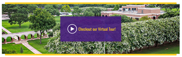
In the screenshot above, emphasis is used to draw the viewer’s eye immediately to the Virtual Tour option. In this image, the composer has created emphasis by placing this element in the center of the image, as well as by using color and high contrast to make the element stand out from the background image of LSUS’s campus. Imagine if the purple box was not present – the link text would probably stand out less, because it would be lacking emphasis.
Form and Function
Form is the medium that makes up a design (for instance, newspaper, digital display, television), while function is the objective of the design (to persuade, suggest, elicit interaction, etc). Critically analyzing the form and function of a piece involves asking questions about the rhetorical situation, as we did above, as well as questions about audience expectations, genre conventions, and whether the chosen media is appropriate for the intended function.
Gestalt Theory

Gestalt theory is based on the maxim that the sum of the whole is greater than its parts, and it is fundamental to visual rhetoric. Though each element of a visual might have meaning on its own, taken in sum, the meaning likely changes. Our perception, and thus the persuasiveness of any piece of visual rhetoric, is based on our understanding of all elements working together. It’s the complete image that creates meaning and persuasive value. So, for example, in the image to the left, the anchor and the “S” each would have some meaning on their own, but it is only when they are combined that they are recognizable as the LSUS logo (and, indeed, that they have any relation to LSUS).
The Golden Ratio
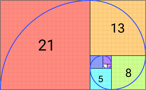
The golden ratio is a naturally-occurring geometric shape based on a mathematical formula that generates specific proportions that are attractive to the human eye. It’s an important ratio for designers because it highlights certain features of the design that are most aesthetically pleasing. The golden ratio is the basis of our modern “grid” design style, which provides a way to proportionally divide a layout into the most pleasing format. For now, knowing what the ratio looks like and that its shorthand is 3:5 or 5:3 is sufficient.
Visual Design
While this is not a course on visual design, there are some basic design concepts that we can start to get acquainted with that might pertain to the types of visuals we need to incorporate in our writing. For our purposes, we will focus on arrangement, lines and shapes, color, and value. Text and typography are also important in design, but we can refer to the document design for some tips on those.
As you’re thinking about these design principles, keep in mind that your purpose needs to come first and foremost. Don’t let focusing on a visually pleasing design get in the way of the function of that design. Looking good is important – but not helpful if you’re not accomplishing your purpose.
Arrangement
You might remember “arrangement” as one of the rhetorical canons discussed in Chapter 7, and it’s crucial when using visuals, whether we are designing the visuals ourselves or simply inserting visuals we have found into a paper. In the design of a visual, arrangement refers to the placement of images, graphics, and text – in other words, where to put all of the elements you want to include.
There are two key elements of arrangement – location and scale. Location refers to where an element is placed. This is where the Golden Ratio is helpful – it allows us to understand the best places to put things in order to maximize aesthetic appeal. Also keep in mind as you’re thinking about location that our eyes typically look at things from left to right and from top to bottom – so, generally, you want the most important elements to be in the top right, or you want to use lines and color to draw the eyes from the top left to wherever the important elements are.
Scale refers to the relative size of the components. Making certain visual elements larger helps them stand out, so you want to use your scale to create emphasis on the most important elements of your visual. Another important note related to scale in your images is that items that are of similar size will be seen as having similar importance, and viewers will likely think that similar-sized items are related. You can use that to your benefit by creating the impression of relationships between elements when you want to link two things.
Finally, arrangement on the page is important for writing with visuals. Here are some key tips for incorporating visuals into your writing:
- Keep in mind that, when you’re using visuals in your writing, the visual and the writing should go together. They are not separate entities, but parts of a whole. So, any image you include should be discussed or at the very least referred to in the writing itself.
- Always include a caption that labels the image, describes it with a short phrase, and gives an attribution if you did not create it (an attribution is like a citation for an image). See the captions throughout this book for examples.
- Use your labels (Figure 1, Image 4, Table 3, etc.) to refer to the image in your writing, rather than phrases like “the image below/above.”
- Try to place the image so that it can be seen at the same time as the writing that accompanies it.
- Avoid re-sizing images too much – you don’t want to decrease their quality.
- To wrap or not to wrap? You might want to wrap your text around your image, or you might want to break your text and have your image in the middle of it, with paragraphs on the top or bottom. This should depend on the size of your image:
- ○ If the width of the image is less than half of the page, wrap the text. Ideally, place your image on the right so that readers can read first and then look at the image as reference.
- ○ If the width of the image is more than half the page, break the text. Center-align the image.
- Avoid having two center-aligned images back-to-back with no text in between them.
Lines and Shapes
Lines and shapes are some of the most basic elements of visual design. While lines may seem simple, they can do several important things for us. Lines can be used to create shapes, form patterns, create emphasis, and create an impression of texture. They might be straight or curved, thick or thin, implied or explicit – all of these choices will make a difference and do something different. For instance, using implied lines can give a sense of order and coherence to a design. And thick lines diverging on a central point can help draw the eye to that point.
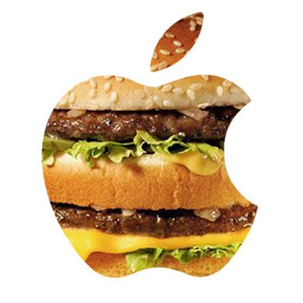
Shapes are self-contained areas formed by lines. The key thing about shapes in design terms is that they are quick and effective ways to get a visual points across. For example, take a look at the figure to the right, which is titled “Big Mac.” Shape is doing a lot of work in this image to help create the visual pun implied by the title. Most of us can likely identify the shape of the Apple logo immediately, and because of that we get the joke pretty quickly. This is precisely why shape is so important in design; using it in a manner like this can help audiences quickly and easily identify things that they are familiar with and make clear connections
Color
Color is perhaps one of the most deeply rhetorical aspects of visual design. The colors that you use in a design can impact an audience deeply, for a few reasons.
First, we often associate colors directly with particular meanings, concepts, and emotions, which makes color a great way to create pathos. For example, blue is often associated with sadness, but is also seen as a calming, friendly color. Red, on the other hand, has associations with love but also with anger, and is usually considered a somewhat aggressive color in visual design. Green has associations with nature as well as with greed or jealousy. This is why, for example, many company websites use shades of blue – they want to give customers a sense of calm and welcome. While we don’t have space to go over all of the colors and their associated meanings here, you can probably think of many others not mentioned here. The important takeaway is to simply think of either what emotions you want your audience to feel and what colors you can use to do that, or to think of what meanings the colors that you want to use might have attached to them.
Color has the added rhetorical benefit of branding and thus creating ethos. For example, most publications, websites, images, etc. created by or associated with LSUS will use the university’s purple and yellow colors to create a direct visual association with the university and therefore invoke the ethos of the university. This is done by many companies and organizations – for instance, the Democratic and Republican parties both use red, white, and blue in their images to instantly connect to the United States.
Finally, using color can help to organize the layout of an image. Using particular layout or text colors can help to create emphasis and hierarchy or to separate distinct areas of the image.
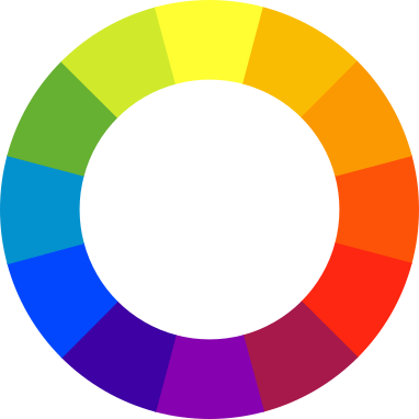
While color can be powerful, it should also be used thoughtfully. You don’t want to go overboard with color, particularly in academic or professional writing. While a reserved use of color can add an impression of professionalism to these documents, too much color can do exactly the opposite. You also want to avoid colors that are too bright or that clash with one another, as these can make your images and documents appear garish – aim for a subdued, complementary color palette. You’ve probably seen the color wheel, pictured in Figure 11. The color wheel helps us choose complementary colors – colors that are across from one another are complementary, whereas the closer that two colors are to one another on the wheel, the more they will clash.
Finally, keep in mind that color can potentially cause accessibility issues for some readers. For that reason, you should avoid having any information that is only presented in color.
Value
Value is the difference between the lightness and darkness of a color. Often, you will see the values of a color depicted as a gradient. For example, you might see a range of shades from very dark to very light green. Value can be used in a variety of ways, and is often used to create a 3D impression in visual design. One of the most important qualities of value (and other elements) for our purposes here is contrast.
Contrast is when visual elements that are noticeably different are placed together, or even placed on top of one another. The difference may be in value, color, size, or shape. While low contrast is sometimes used to create subtlety, in general we want to aim for high contrast, which is when there is a very noticeable difference between elements. High contrast helps make an image clearer and can help to create emphasis. It can also aid accessibility and make images easier to read or see – low contrast, on the other hand, can appear blurry.
Consider the text that you are reading as a simple example. It should be fairly easy to read for most people. Part of why it is easy to read is because it uses black text on a white background – a high contrast that makes the text easily stand out. And when we use headings or want to highlight key words and concepts, we use bolding to make it stand out with an even higher degree of contrast. Now, imagine if this book was written entirely with light grey text, like this.
EXAMPLE TEXT IN LIGHT GRAY
The book would be much more difficult to read and much harder on the eyes if the entirety of it was written in this color, would it not? What about this one?
EXAMPLE TEXT IN VERY LIGHT YELLOW
Now we’re using even lower contrast. If you can read that, we hope you see the point. Higher contrast simply makes things easier to read. So, one takeaway here is that contrast is especially important when you use text in an image – you want to make sure that your text clearly stands out from your background or layout so that your audience isn’t missing key information.
Visual Analysis
Like a rhetorical analysis of a text, a rhetorical analysis of a visual should examine the visual using concepts from rhetoric and visual design, as described in this chapter and in Chapters 1 and 7, to determine how effective the image is at accomplishing its purpose.
When performing a visual analysis, ask yourself:
- What argument is the visual making?
- What visual elements is it using to make that argument?
- How do the visual elements support the argument, both individually and together?
- Who is the visual’s audience?
- How is the visual considering its audience?
- Is the visual making its intended argument effectively?
Asking these questions can help you simplify the task of doing a visual analysis. Visuals often have a lot of elements coming together into an overall whole, and analyzing all of those elements can be a daunting task. Asking the questions above can help you focus your analysis on those elements that are especially salient to the success (or lack thereof) of the visual’s argument.
Listen to the Audio Chapter
Media Attributions
- white space 1 © Textbook Authors
- white space 2 © Textbook Authors
- white space 3 © Textbook Authors
- Serifs © Textbook Authors is licensed under a CC BY-NC-SA (Attribution NonCommercial ShareAlike) license
- serif fonts © Textbook Authors is licensed under a CC BY-NC-SA (Attribution NonCommercial ShareAlike) license
- LSUS Homepage © Textbook Authors is licensed under a All Rights Reserved license
- LSUS Virtual Tour © Textbook Authors is licensed under a All Rights Reserved license
- LSUS Anchor Logo © Textbook Authors is licensed under a All Rights Reserved license
- Fibonacci_Spiral.svg © Romain is licensed under a CC BY-SA (Attribution ShareAlike) license
- Big Mac
- color wheel © Sakurambo is licensed under a CC BY-SA (Attribution ShareAlike) license
