Chapter 8 Statistics
8.2 Visualizing Data
Learning Objectives
By the end of this section, you will be able to:
- Create charts and graphs to appropriately represent data
- Interpret visual representations of data
- Determine misleading components in data displayed visually
Summarizing raw data is the first step we must take when we want to communicate the results of a study or experiment to a broad audience. However, even organized data can be difficult to read; for example, if a frequency table is large, it can be tough to compare the first row to the last row. As the old saying goes, a picture is worth a thousand words (or, in this case, summary statistics)! Just as our techniques for organizing data depended on the type of data we were looking at, the methods we’ll use for creating visualizations will vary. Let’s start by considering categorical data.
Visualizing Categorical Data
If the data we’re visualizing are categorical, then we want a quick way to represent graphically the relative numbers of units that fall in each category. When we created the frequency distributions in the last section, all we did was count the number of units in each category and record that number (this was the frequency of that category). Frequencies are nice when we’re organizing and summarizing data; they’re easy to compute, and they’re always whole numbers. But they can be difficult to understand for an outsider who’s being introduced to your data.
Let’s consider a quick example. Suppose you surveyed some people and asked for their favorite color. You communicated your results using a frequency distribution. Jerry is interested in data on favorite colors, so he reads your frequency distribution. The first row shows that 12 people indicated green was their favorite color. However, Jerry has no way of knowing if that’s a lot of people without knowing how many people total took your survey. Twelve is a pretty significant number if only 25 people took the survey, but it’s next to nothing if you recorded 1,000 responses. For that reason, we will often summarize categorical data not with frequencies but with proportions. The proportion of data that fall into a particular category is computed by dividing the frequency for that category by the total number of units in the data.
[latex]\text{Proportion of a category} = \frac{\text{Category frequency}}{\text{Total number of data units}}[/latex]
Proportions can be expressed as fractions, decimals, or percentages.
Example 1
Recall Example 2 in Section 8.1, in which a teacher recorded the responses on the first question of a multiple-choice quiz, with five possible responses (A, B, C, D, and E). The raw data were as follows:
| A | A | C | A | B | B | A |
| E | A | C | A | A | A | C |
| E | A | B | A | A | C | A |
| B | E | E | A | A | C | C |
We computed a frequency distribution that looked like this:
[latex]\begin{array} {|c|c|} \hline \textbf{Response to First Question} & \textbf{Frequency} \\ \hline \text{A} & \text{14} \\ \hline \text{B} & \text{4} \\ \hline \text{C} & \text{6} \\ \hline \text{D} & \text{0} \\ \hline \text{E} & \text{4} \\ \hline \end{array}[/latex]
[latex]\text{Proportion of a category} = \frac{\text{Category frequency}}{\text{Total number of data units}}[/latex]
Now let’s compute the proportions for each category.
Step 1: In order to compute a proportion, we need the frequency (which we have in the table above) and the total number of units that are represented in our data. We can find that by adding up the frequencies from all the categories: [latex]14+4+6+0+4=28[/latex].
Step 2: To find the proportions, we divide the frequency by the total. For the first category (“A”), the proportion is [latex]\frac{14}{28} = \frac{1}{2} = 0.5 = 50 \%[/latex]. We can compute the other proportions similarly, filling in the rest of the table:
[latex]\begin{array} {|c|c|c|} \hline \textbf{Response to First Question} & \textbf{Frequency} & \textbf{Proportion} \\ \hline \text{A} & \text{14} & \frac{14}{28} = 50 \% \\ \hline \text{B} & \text{4} & \frac{4}{28} = 14.3 \%\\ \hline \text{C} & \text{6} & \frac{6}{28} = 21.4 \% \\ \hline \text{D} & \text{0} & \frac{0}{28} = 0 \% \\ \hline \text{E} & \text{4} & \frac{4}{28} = 14.3 \% \\ \hline \end{array}[/latex]
Step 3: Check your work: if you add up your proportions, you should get 1 (if you’re using fractions or decimals) or 100% (if you’re using percentages). In this case, [latex]50 \% +14.3 \% + 21.4 \% +0 \% +14.3 \% = 100 \%[/latex].
Note: If you need to round off the results of the computations to get your percentages or decimals, then the sum might not be exactly equal to 1 or 100% in the end due to that rounding error.
Exercise 1
In the last section, students in a statistics class were asked to provide their majors. Those results are again listed below:
| Undecided | Biology | Biology | Sociology |
| Political Science | Sociology | Undecided | Undecided |
| Undecided | Biology | Biology | Education |
| Biology | Biology | Political Science | Political Science |
You created the frequency distribution:
[latex]\begin{array} {|c|c|} \hline \textbf{Major} & \textbf{Frequency} \\ \hline \text{Biology} & \text{6} \\ \hline \text{Education} & \text{1} \\ \hline \text{Political Science} & \text{3} \\ \hline \text{Sociology} & \text{2} \\ \hline \text{Undecided} & \text{4} \\ \hline \end{array}[/latex]
Now find the proportions associated with each category. Express your answers as percentages.
Solution
[latex]\begin{array} {|c|c|} \hline \textbf{Major} & \textbf{Frequency} & \textbf{Proportion} \\ \hline \text{Biology} & \text{6} & 37.5 \% \\ \hline \text{Education} & \text{1} & 6.3 \% \\ \hline \text{Political Science} & \text{3} & 18.8 \% \\ \hline \text{Sociology} & \text{2} & 12.5 \% \\ \hline \text{Undecided} & \text{4} & 25 \% \\ \hline \end{array}[/latex]
Note that these percentages add up to 100.1%, due to the rounding.
Now that we can compute proportions, let’s turn to visualizations. There are two primary visualizations that we’ll use for categorical data: bar charts and pie charts. Both of these data representations work on the same principle: if proportions are represented as areas, then it’s easy to compare two proportions by assessing the corresponding areas. Let’s look at bar charts first.
Bar Charts
A bar chart is a visualization of categorical data that consists of a series of rectangles arranged side-by-side (but not touching). Each rectangle corresponds to one of the categories. All of the rectangles have the same width. The height of each rectangle corresponds to either the number of units in the corresponding category or the proportion of the total units that fall into the category.
Example 2
In Example 1, we computed the following proportions:
[latex]\begin{array} {|c|c|c|} \hline \textbf{Response to First Question} & \textbf{Frequency} & \textbf{Proportion} \\ \hline \text{A} & \text{14} & \frac{14}{28} = 50 \% \\ \hline \text{B} & \text{4} & \frac{4}{28} = 14.3 \%\\ \hline \text{C} & \text{6} & \frac{6}{28} = 21.4 \% \\ \hline \text{D} & \text{0} & \frac{0}{28} = 0 \% \\ \hline \text{E} & \text{4} & \frac{4}{28} = 14.3 \% \\ \hline \end{array}[/latex]
Draw a bar chart to visualize this frequency distribution.
Step 1: To start, we’ll draw axes with the origin (the point where the axes meet) at the bottom left:

Step 2: Next, we’ll place our categories evenly spaced along the bottom of the horizontal axis. The order doesn’t really matter, but if the categories have some sort of natural order (like in this case, where the responses are labeled A to E), it’s best to maintain that order. We’ll also label the horizontal axis:
Step 3: Now we have a decision to make: Will we use frequencies to define the height of our rectangles, or will we use proportions? Let’s try it both ways. First, let’s use frequencies. Notice that our frequencies run from 0 to 14; this will correspond to the scale we put on the vertical axis. If we put a tick mark for every whole number between 0 and 14, the result will be pretty crowded; let’s instead put a mark on the multiples of 3 or 5:
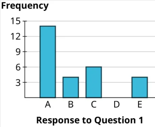
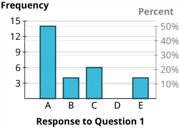
Step 4: Now let’s draw in the first rectangle. The frequency associated with “A” is 14. So we’ll go to 14 on the vertical axis and place a mark at that height above the “A” label:
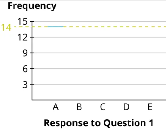
Step 5: Then, draw vertical lines straight down from the edges of your mark to make a rectangle:
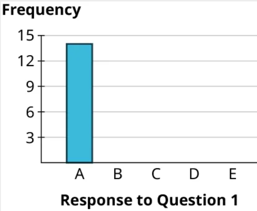
Step 6: Finally, we can build the rest of the rectangles, making sure that the bases all have the same length of the base = width of the rectangle and the rectangles don’t touch. Notice that since the frequency for “D” is 0, that category has no rectangle (but we’ll leave a space there so the reader can see that there is a category with frequency 0). Here’s the result:
Step 7: That’s it! Now let’s use proportions instead of frequencies. We’ll label the vertical axis with evenly spaced numbers that run the full range of the percentages in our table: 0% to 50%. We can divide that into 5 equal parts (so that each has a width of 10%), and use that to label our vertical axis:
Step 8: Then, we can fill in the rectangles just as we did before. The height of the “A” rectangle is 50%, the “B” rectangle goes up to 14.3%, “C” goes to 21.4%, there is no rectangle for “D” (since its proportion is 0%), and the “E” rectangle also goes up to 14.3%:
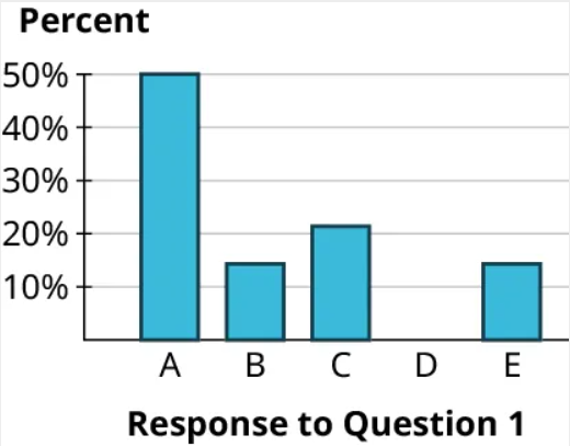
Step 9: Notice that the rectangles are basically identical in our two final bar charts. That’s no coincidence! Bar charts that use proportions and those that use frequencies will always look identical (which is why it doesn’t really matter much which option you choose). Here’s why: Look at the bars for “B” and “C.” The frequencies for these are 4 and 6, respectively. Notice that 6 is 50% bigger than 4 (since [latex]6=1.5 \times 4[/latex]), which means that the “C” bar will be 50% higher than the “B” bar. Now look at the same bars using proportions: since [latex]21.4 \% =1.5 \times 14.3 \%[/latex], the bar for “C” will be 50% higher than the bar for “B.” The same relationships hold for the other bars too.
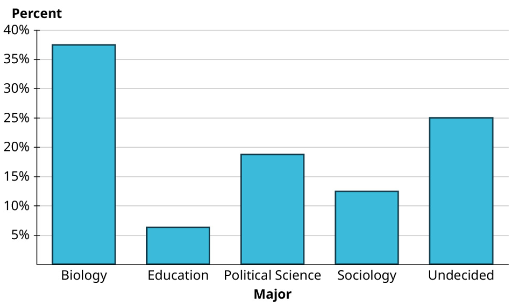
Exercise 2
The students in a statistics class were asked to provide their majors. The computed proportions for each of the categories are as follows:
[latex]\begin{array} {|c|c|c|} \hline \textbf{Major} & \textbf{Frequency} & \textbf{Proportion}\\ \hline \text{Biology} & \text{6} & 37.5 \% \\ \hline \text{Education} & \text{1} & 6.3 \% \\ \hline \text{Political Science} & \text{3} & 18.8 \% \\ \hline \text{Sociology} & \text{2} & 12.5 \% \\ \hline \text{Undecided} & \text{4} & 25 \% \\ \hline \end{array}[/latex]
Create a bar graph to visualize these data. Use percentages to label the vertical axis.
Solution
Now that we’ve explored how bar graphs are made, let’s get some practice reading bar graphs.
Example 3
The bar graph shown gives data on 2020 model year cars available in the United States. Analyze the graph to answer the following questions.
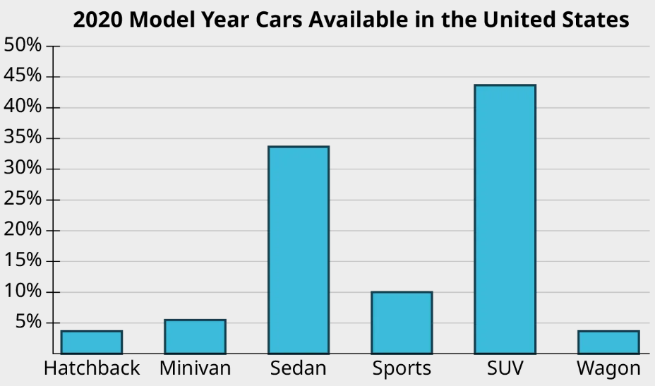
(a) What proportion of available cars were sports cars?
The bar for sports cars goes up to 10%, so the proportion of models that are considered sports cars is 10%.
(b) What proportion of available cars were sedans?
The bar corresponding to sedan goes up past 30% but not quite to 35%. It looks like the proportion we want is between 33% and 34%.
(c) Which categories of cars each made up less than 5% of the models available?
We’re looking for the bars that don’t make it all the way to the 5% line. Those categories are hatchback and wagon.
Exercise 3
The bar graph shows the region of every institution of higher learning in the United States (except for the service academies, like West Point).
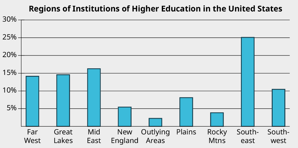
Analyze the bar chart to answer the following questions.
a) Which region contains the largest number of institutions of higher learning?
b) What proportion of all institutions of higher learning can be found in the Southwest?
c) Which regions each have under 5% of the total number of institutions of higher learning?
Solution
a) Southeast
b) Just over 10%
c) Outlying Areas and Rocky Mtns.
Pie Charts
A pie chart consists of a circle divided into wedges, with each wedge corresponding to a category. The proportion of the area of the entire circle that each wedge represents corresponds to the proportion of the data in that category. Pie charts are difficult to make without technology because they require careful measurements of angles and precise circles, both of which are tasks better left to computers.
Here is a video on creating pie charts in Google Sheets:
Pie charts are sometimes embellished with features like labels in the slices (which might be the categories, the frequencies in each category, or the proportions in each category) or a legend that explains which colors correspond to which categories. When making your own pie chart, you can decide which of those to include. The only rule is that there has to be some way to connect the slices to the categories (either through labels or a legend).
Example 4
Use the data that follows to generate a pie chart.
| Type | Percent |
| SUV | 43.6% |
| Sedan | 33.6% |
| Sports | 10.0% |
| Minivan | 5.5% |
| Hatchback | 3.6% |
| Wagon | 3.6% |
First, enter the chart above into a new sheet in Google Sheets. Next, click and drag to select the full table (including the header row). Click on the “Insert” menu, then select “Chart.” The result may be a pie chart by default; if it isn’t, you can change it to a pie chart using the “Chart type” drop-down menu in the Chart Editor.
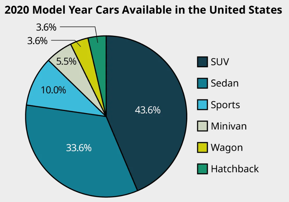
You can choose to use a legend to identify the categories as well as label the slices with the relevant percentages.
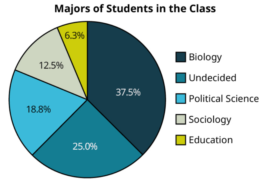
Exercise 4
In a previous exercise, you created a bar chart using data on reported majors from students in a class. Here are those proportions again (sorted from largest to smallest):
[latex]\begin{array} {|c|c|} \hline \textbf{Major} & \textbf{Proportion}\\ \hline \text{Biology} & 37.5 \% \\ \hline \text{Undecided} & 25 \% \\ \hline \text{Political Science} & 18.8 \% \\ \hline \text{Sociology} & 12.5 \% \\ \hline \text{Education} & 6.3 \% \\ \hline \end{array}[/latex]
Create a pie graph using those data.
Solution
Visualizing Quantitative Data
There are several good ways to visualize quantitative data. In this section, we’ll talk about two types: stem-and-leaf plots and histograms.
Stem-and-Leaf Plots
Stem-and-leaf plots are visualization tools that fall somewhere between a list of all the raw data and a graph. A stem-and-leaf plot consists of a list of stems on the left and the corresponding leaves on the right, separated by a line. The stems are the numbers that make up the data only up to the next-to-last digit, and the leaves are the final digits. There is one leaf for every data value (which means that leaves may be repeated), and the leaves should be evenly spaced across all stems. These plots are really nothing more than a fancy way of listing out all the raw data; as a result, they shouldn’t be used to visualize large datasets.
This concept can be difficult to understand without referencing an example, so let’s first look at how to read a stem-and-leaf plot.
Example 5
A collector of trading cards records the sale prices (in dollars) of a particular card on an online auction site and puts the results in a stem-and-leaf plot:
| 0 | 5 8 9 |
| 1 | 0 0 0 3 4 4 5 5 5 5 6 9 9 |
| 2 | 0 0 0 0 5 5 9 9 |
| 3 | 0 0 0 5 5 |
| 4 | 0 0 5 |
| 5 | |
| 6 | 0 |
Answer the following questions about the data:
a) How many prices are represented?
Each leaf (the numbers on the right side of the bar) represents one data value. So on the first row (which looks like 0 | 5 8 9), there are three data values (one for each leaf: 5, 8, and 9). The next row has 13 leaves, then 8, 5, 3, 0, and 1. Adding those up, we get [latex]3+13+8+5+3+0+1=33[/latex] data points or prices.
b) What prices represent the five most expensive cards? The five least expensive?
The most expensive card is the last one listed. Its stem is 6 and its leaf is 0, so the price is $60. There are no leaves associated with the 5 stem, so there were no cards sold for $50 to $59. The next most expensive cards are then on the 4 stem: $45, $40, and $40 (remember, repeated leaves mean repeated values in the dataset). So we have our four most expensive cards. The fifth would be on the next stem up. The biggest leaf on the 3 stem is a 5, so the fifth-most expensive card sold for $35.
As for the five least-expensive cards, the smallest stem is 0, with leaves 5, 8, and 9. So the three least expensive cards sold for $5, $8, and $9 (notice that we don’t write down that leading 0 from the stem in the tens place). The next two least-expensive cards will be the two smallest leaves on the next stem: $10 and $10.
c) What is the full set of data?
The full list of data is: 5, 8, 9, 10, 10, 10, 13, 14, 14, 15, 15, 15, 15, 16, 19, 19, 20, 20, 20, 24, 25, 25, 29, 29, 30, 30, 30, 35, 35, 40, 40, 45, 60.
Exercise 5
The stem-and-leaf plot below shows data collected from a sample of college students who were asked how far (in miles) they commute each day:
| 0 | 4 6 7 |
| 1 | 0 0 0 2 2 2 4 5 8 8 |
| 2 | 0 5 5 5 |
| 3 | 0 0 5 5 6 |
| 4 | |
| 5 | 0 |
| 6 | 0 |
a) How many data points are represented?
b) What are the three longest and shortest commutes?
c) What is the full list of data?
Solution
a) 24
b) The longest commutes are 60, 50, and 36 miles; the shortest are 4, 6, and 7 miles.
c) 4, 6, 7, 10, 10, 10, 12, 12, 12, 14, 15, 18, 18, 20, 25, 25, 25, 30, 30, 35, 35, 36, 50, 60
Stem-and-leaf plots are useful in that they give us a sense of the shape of the data. Are the data evenly spread out over the stems, or are some stems “heavier” with leaves? Are the heavy stems on the low side, the high side, or somewhere in the middle? These are questions about the distribution of the data, or how the data are spread out over the range of possible values.
Some words we use to describe distributions are uniform (data are equally distributed across the range), symmetric (data are bunched up in the middle, then taper off in the same way above and below the middle), left-skewed (data are bunched up at the high end or larger values and taper off toward the low end or smaller values), and right-skewed (data are bunched up at the low end and taper off toward the high end). See Figure 15 below.
Looking back at the stem-and-leaf plot in the previous example, we can see that the data are bunched up at the low end and taper off toward the high end; that set of data is right-skewed. Knowing the distribution of a set of data gives us useful information about the property that the data are measuring.
Now that we have a better idea of how to read a stem-and-leaf plot, we’re ready to create our own.
Example 6
An entomologist studying crickets recorded the number of times different crickets (of differing species, genders, etc.) chirped in a one-minute span. The raw data are as follows:
| 89 | 97 | 82 | 102 | 84 | 99 | 93 | 103 | 120 | 91 |
| 115 | 105 | 89 | 109 | 107 | 89 | 104 | 82 | 106 | 92 |
| 101 | 109 | 116 | 103 | 100 | 91 | 85 | 104 | 104 | 106 |
Construct a stem-and-leaf plot to visualize these results.
Step 1: Before we can create the plot, we need to sort the data in order from smallest to largest:
| 82 | 82 | 84 | 85 | 89 | 89 | 89 | 91 | 91 | 92 |
| 93 | 97 | 99 | 100 | 101 | 102 | 103 | 103 | 104 | 104 |
| 104 | 105 | 106 | 106 | 107 | 109 | 109 | 115 | 116 | 120 |
Step 2: Next, we identify the stems. To do that, we cut off the final digit of each number, which leaves us with stems of 8, 9, 10, 11, and 12. Arrange the stems vertically, and add the bar to separate these from the leaves:
| 8 |
| 9 |
| 10 |
| 11 |
| 12 |
Step 3: Write down the leaves on the right side of the bar, giving just the final digit (that we cut off to make the stems) of each data value. List these in order, and make sure they line up vertically:
| 8 | 2 2 4 5 9 9 9 |
| 9 | 1 1 2 3 7 9 |
| 10 | 0 1 3 3 4 4 4 5 6 6 7 9 9 |
| 11 | 5 6 |
| 12 | 0 |
Exercise 6
This table gives the records of the Major League Baseball teams at the end of the 2019 season:
| Team | Wins | Losses |
|---|---|---|
| HOU | 107 | 55 |
| LAD | 106 | 56 |
| NYY | 103 | 59 |
| MIN | 101 | 61 |
| ATL | 97 | 65 |
| OAK | 97 | 65 |
| TBR | 96 | 66 |
| CLE | 93 | 69 |
| WSN | 93 | 69 |
| STL | 91 | 71 |
| MIL | 89 | 73 |
| NYM | 86 | 76 |
| ARI | 85 | 77 |
| BOS | 84 | 78 |
| CHC | 84 | 78 |
| PHI | 81 | 81 |
| TEX | 78 | 84 |
| SFG | 77 | 85 |
| CIN | 75 | 87 |
| CHW | 72 | 89 |
| LAA | 72 | 90 |
| COL | 71 | 91 |
| SDP | 70 | 92 |
| PIT | 69 | 93 |
| SEA | 68 | 94 |
| TOR | 67 | 95 |
| KCR | 59 | 103 |
| MIA | 57 | 105 |
| BAL | 54 | 108 |
| DET | 47 | 114 |
Create a stem-and-leaf plot for the number of wins.
Solution
| 4 | 7 |
| 5 | 9 7 4 |
| 6 | 9 8 7 |
| 7 | 8 7 5 2 2 1 0 |
| 8 | 9 6 5 4 4 1 |
| 9 | 7 7 6 3 3 1 |
| 10 | 7 6 3 1 |
As we mentioned above, stem-and-leaf plots aren’t always going to be useful. For example, if all the data in your dataset are between 20 and 29, then you’ll just have one stem, which isn’t terribly useful. (Although there are methods like stem splitting for addressing that particular problem, we won’t go into those at this time.) On the other end of the spectrum, the data may be so spread out that every stem has only one leaf. (This problem can sometimes be addressed by rounding off the data values to the tens, hundreds, or some other place value, then using that place for the leaves.) Finally, if you have dozens or hundreds (or more) of data values, then a stem-and-leaf plot becomes too unwieldy to be useful. Fortunately, we have other tools we can use.
Histograms
Histograms are visualizations that can be used for any set of quantitative data, no matter how big or spread out. They differ from a categorical bar chart in that the horizontal axis is labeled with numbers (not ranges of numbers), and the bars are drawn so that they touch each other. The heights of the bars reflect the frequencies in each bin. Unlike with stem-and-leaf plots, we cannot re-create the original dataset from a histogram. However, histograms are easy to make with technology and are great for identifying the distribution of our data. Let’s first create one histogram without technology to help us better understand how histograms work.
Example 7
In Example 6, we built a stem-and-leaf plot for the number of chirps made by crickets in one minute. Here are the raw data that we used then:
| 89 | 97 | 82 | 102 | 84 | 99 |
| 115 | 105 | 89 | 109 | 107 | 89 |
| 101 | 109 | 116 | 103 | 100 | 91 |
| 93 | 103 | 120 | 91 | 85 | 104 |
| 104 | 82 | 106 | 92 | 104 | 106 |
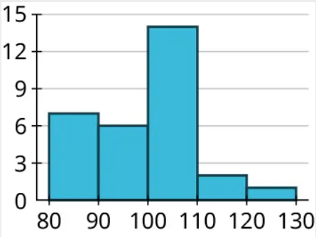
Construct a histogram to visualize these results.
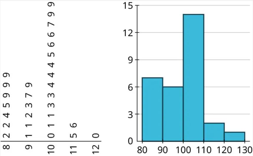
Step 1: Add data to bins. Histograms are built on binned frequency distributions, so we’ll make that first. Luckily, the stem-and-leaf plot we made earlier can help us do this much more quickly:
| 8 | 2 2 4 5 9 9 9 |
| 9 | 1 1 2 3 7 9 |
| 10 | 0 1 2 3 3 4 4 4 5 6 6 7 9 9 |
| 11 | 5 6 |
| 12 | 0 |
If we’re using bins of width 10, we can compute the frequencies by counting the numbers of leaves associated with the corresponding stem:
| Bin | Frequency |
|---|---|
| 80-89 | 7 |
| 90-99 | 6 |
| 100-109 | 14 |
| 110-119 | 2 |
| 120-129 | 1 |
(Note that when we made binned frequency diagrams in the last module, we noted that if the biggest data value was right on the border between two bins, it was OK to lump it in with the lower bin. That’s not recommended when building histograms, so the data value 120 is all alone in the 120-129 bin.)
Step 2: Create the axes. On the horizontal axis, start labeling with the lower end of the first bin (in this case, 80), and go up to the higher end of the last bin (120). Mark off the other bin boundaries, making sure they’re all evenly spaced. On the vertical axis, start with 0 and go up at least to the greatest frequency you see in your bins (14 in this example), making sure that the labels you make are evenly spaced and that the difference between those numbers is the same. Let’s count off our vertical axis by threes:
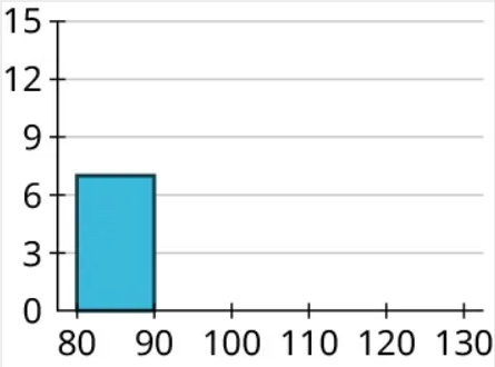
Step 3: Draw in the bars. Remember that the bars of a histogram touch and that the heights are determined by the frequency. So the first bar will cover 80 to 90 on the horizontal axis and have a height of 7:
Now we can fill in the others:
In the last exercise, you made a stem-and-leaf plot of the number of wins for each MLB team in 2019 using this set of data:
| Team | Wins | Losses |
|---|---|---|
| HOU | 107 | 55 |
| LAD | 106 | 56 |
| NYY | 103 | 59 |
| MIN | 101 | 61 |
| ATL | 97 | 65 |
| OAK | 97 | 65 |
| TBR | 96 | 66 |
| CLE | 93 | 69 |
| WSN | 93 | 69 |
| STL | 91 | 71 |
| MIL | 89 | 73 |
| NYM | 86 | 76 |
| ARI | 85 | 77 |
| BOS | 84 | 78 |
| CHC | 84 | 78 |
| PHI | 81 | 81 |
| TEX | 78 | 84 |
| SFG | 77 | 85 |
| CIN | 75 | 87 |
| CHW | 72 | 89 |
| LAA | 72 | 90 |
| COL | 71 | 91 |
| SDP | 70 | 92 |
| PIT | 69 | 93 |
| SEA | 68 | 94 |
| TOR | 67 | 95 |
| KCR | 59 | 103 |
| MIA | 57 | 105 |
| BAL | 54 | 108 |
| DET | 47 | 114 |
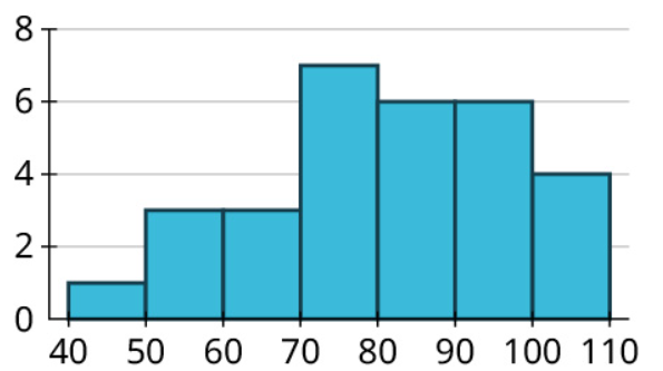
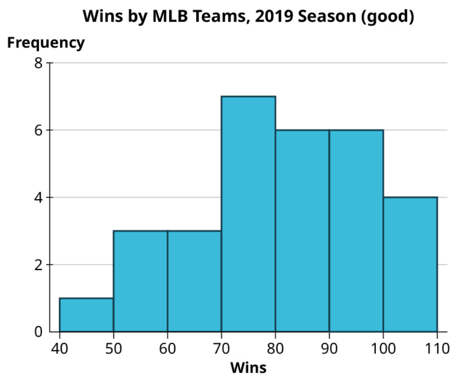
Create a histogram for the number of wins. Use bins of width 10, starting with a bin for 40-49 (so that your histogram reflects the stem-and-leaf plot you made earlier).
Solution
Misleading Graphs
Graphical representations of data can be manipulated in ways that intentionally mislead the reader. There are two primary ways this can be done: by manipulating the scales on the axes and by manipulating or misrepresenting areas of bars. Let’s look at some examples of these.
Example 8
The table below shows the teams and their payrolls in the English Premier League, the top soccer organization in the United Kingdom.
| Team | Salary (£1,000,000s) |
|---|---|
| Manchester United F.C. | 175.7 |
| Manchester City F.C. | 136.5 |
| Chelsea F.C. | 132.8 |
| Arsenal F.C. | 130.7 |
| Tottenham Hotspur F.C. | 129.2 |
| Liverpool F.C. | 118.6 |
| Crystal Palace | 85.0 |
| Everton F.C. | 82.5 |
| Leicester City | 73.7 |
| West Ham United F.C. | 69.2 |
| Newcastle United F.C. | 56.9 |
| Aston Villa F.C. | 52.3 |
| Fulham F.C. | 52.1 |
| Southampton F.C. | 49.6 |
| Wolverhampton Wanderers F.C. | 49.5 |
| Brighton & Hove Albion | 43.7 |
| Burnley F.C. | 35.5 |
| West Bromwich Albion F.C. | 23.8 |
| Leeds United F.C. | 22.5 |
| Sheffield United F.C. | 19.7 |
(Source: www.spotrac.com)
How might someone present these data in a misleading way?
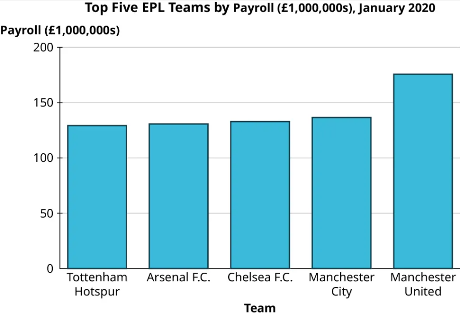
Step 1: Let’s focus on the top five teams. Here’s a bar chart of their payrolls:
Step 2: Now here’s another bar chart visualizing exactly the same data:
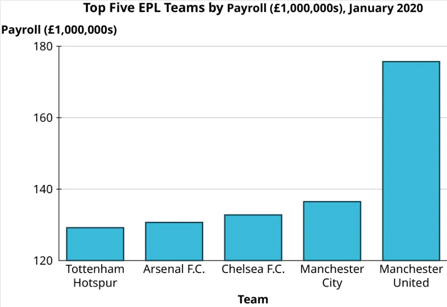
Step 3: You should notice that despite using the same data, these two graphs look strikingly different. In the second graph, the gap between Manchester United and the other four teams looks significantly larger than in the first graph. The scale on the vertical axis has been manipulated here. The first graph’s axis starts at 0, while the lowest value on the second graph’s axis is 120. This trick has a strong impact on the viewer’s perception of the data.
Beware of vertical axes that don’t start at zero! They overemphasize differences in heights.
Step 4: To further emphasize the difference this creates in our perception, let’s look at those data again, but this time using graphics instead of colored areas on our bar graph.
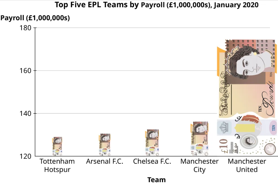
This graph uses an image of a £10 banknote in place of the bars. Using an image that evokes the context of the data in place of a standard, “boring” bar is a common tool that people use when creating infographics. However, this is generally not a good practice because it distorts the data. Notice that our “bars” (the banknotes) are just as tall here as they were in the previous figure. But to maintain the right proportions, the widths had to be adjusted as well, which changes the area (height × width) of each bar. A key point is that when looking at rectangles, the human eye tends to process areas more easily than heights.
Beware of infographics! Areas overemphasize a difference that should be measured with a height!
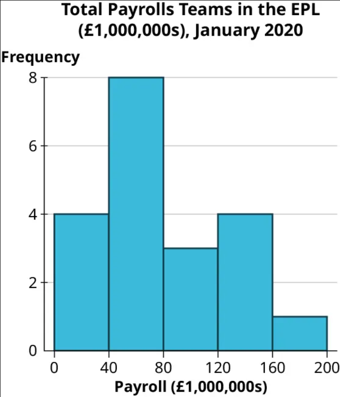
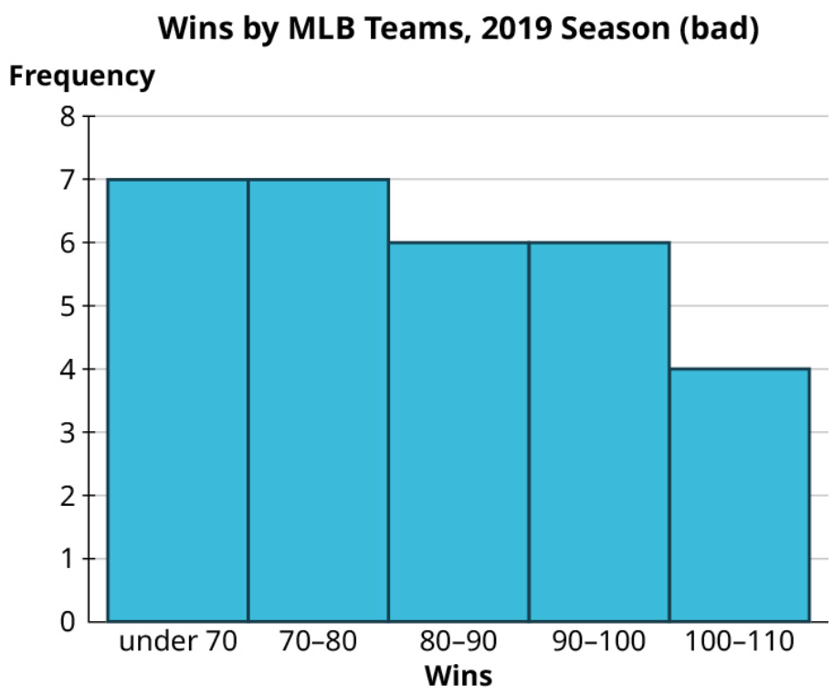
Step 5: Now let’s look at all 20 teams. This histogram indicates that the data are right-skewed, with the highest number of teams having a payroll between £40 million and £80 million:
Step 6: Now let’s view this same data in another chart:
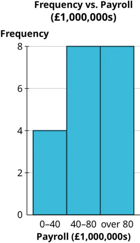
Step 7: Even though this chart uses the same data, the skew seems to be reversed. Why? Well, even though this graph looks like a histogram, it isn’t. Look closely at the labels on the horizontal axis; they don’t correspond to spots on the axis but instead provide a range, meaning this is a bar graph based on a binned frequency distribution.
When we review these ranges, we can see that the last range is misleading, as it consists of all data “over 80.” If the bins all had the same width, that last bin would run from 80 to 120. However, we can see from the histogram that the maximum value for these data is between 160 and 200. If the last bin in this bar graph were labeled honestly, it would read “80–200,” which would drive home the fact that the width of that bar is misleading.
Always check the horizontal axis on histograms! The widths of all the bars should be equal.
Exercise 8
Take a look again at the win totals for teams in Major League Baseball in 2019:
| Team | Wins | Losses |
|---|---|---|
| HOU | 107 | 55 |
| LAD | 106 | 56 |
| NYY | 103 | 59 |
| MIN | 101 | 61 |
| ATL | 97 | 65 |
| OAK | 97 | 65 |
| TBR | 96 | 66 |
| CLE | 93 | 69 |
| WSN | 93 | 69 |
| STL | 91 | 71 |
| MIL | 89 | 73 |
| NYM | 86 | 76 |
| ARI | 85 | 77 |
| BOS | 84 | 78 |
| CHC | 84 | 78 |
| PHI | 81 | 81 |
| TEX | 78 | 84 |
| SFG | 77 | 85 |
| CIN | 75 | 87 |
| CHW | 72 | 89 |
| LAA | 72 | 90 |
| COL | 71 | 91 |
| SDP | 70 | 92 |
| PIT | 69 | 93 |
| SEA | 68 | 94 |
| TOR | 67 | 95 |
| KCR | 59 | 103 |
| MIA | 57 | 105 |
| BAL | 54 | 108 |
| DET | 47 | 114 |
(Source: https://www.espn.com/mlb/standings/_/season/2019/view)
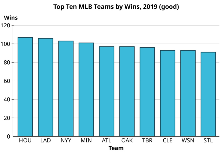
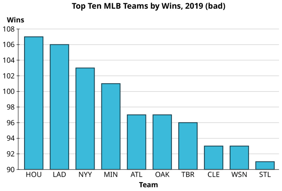
Make one good and one misleading chart showing the number of wins by the top ten teams. Then, looking at all the teams, make one good and one misleading histogram for the win totals.
Solution
Top ten teams by wins:
Here is a video to help you spot misleading graphs:
Media Attributions
- 8.2 01 © OpenStax Contemporary Math is licensed under a CC BY (Attribution) license
- 8.2 02 © OpenStax Contemporary Math is licensed under a CC BY (Attribution) license
- 8.2 03 © OpenStax Contemporary Math is licensed under a CC BY (Attribution) license
- 8.2 04 © OpenStax Contemporary Math is licensed under a CC BY (Attribution) license
- 8.2 05 © OpenStax Contemporary Math is licensed under a CC BY (Attribution) license
- 8.2 06 © OpenStax Contemporary Math is licensed under a CC BY (Attribution) license
- 8.2 07 © OpenStax Contemporary Math is licensed under a CC BY (Attribution) license
- 8.2 08 © OpenStax Contemporary Math is licensed under a CC BY (Attribution) license
- 8.2 09 © OpenStax Contemporary Math is licensed under a CC BY (Attribution) license
- 8.2 10 © OpenStax Contemporary Math is licensed under a CC BY (Attribution) license
- 8.2 11 © OpenStax Contemporary Math is licensed under a CC BY (Attribution) license
- 8.2 12 © OpenStax Contemporary Math is licensed under a CC BY (Attribution) license
- 8.2 13 © OpenStax Contemporary Math is licensed under a CC BY (Attribution) license
- 8.2 14 © OpenStax Contemporary Math is licensed under a CC BY (Attribution) license
- 8.2 16 © OpenStax Contemporary Math is licensed under a CC BY (Attribution) license
- 8.2 17 © OpenStax Contemporary Math is licensed under a CC BY (Attribution) license
- 8.2 18 © OpenStax Contemporary Math is licensed under a CC BY (Attribution) license
- 8.2 19 © OpenStax Contemporary Math is licensed under a CC BY (Attribution) license
- 8.2 20 © OpenStax Contemporary Math is licensed under a CC BY (Attribution) license
- 8.2 21 © OpenStax Contemporary Math is licensed under a CC BY (Attribution) license
- 8.2 22 © OpenStax Contemporary Math is licensed under a CC BY (Attribution) license
- 8.2 23 © OpenStax Contemporary Math is licensed under a CC BY (Attribution) license
- 8.2 24 © OpenStax Contemporary Math is licensed under a CC BY (Attribution) license
- 8.2 25 © OpenStax Contemporary Math is licensed under a CC BY (Attribution) license
- 8.2 26 © OpenStax Contemporary Math is licensed under a CC BY (Attribution) license
- 8.2 27 © OpenStax Contemporary Math is licensed under a CC BY (Attribution) license
- 8.2 28 © OpenStax Contemporary Math is licensed under a CC BY (Attribution) license
- 8.2 29 © OpenStax Contemporary Math is licensed under a CC BY (Attribution) license
A visualization of categorical data that consists of a series of rectangles arranged side-by-side (but not touching).
Consists of a circle divided into wedges, with each wedge corresponding to a category.
Consists of a list of stems on the left and the corresponding leaves on the right, separated by a line.
Data are equally distributed across the range.
Data are bunched up in the middle, then taper off in the same way above and below the middle.
Data are bunched up at the high end or larger values and taper off toward the low end or smaller values.
Data are bunched up at the low end and taper off toward the high end.
Visualizations that can be used for any set of quantitative data, no matter how big or spread out.
