Chapter 10: Linear Regression and Correlation
10.6 Outliers
Learning Objectives
By the end of this section, the student should be able to:
- Find and interpret outliers between two quantitative variables.
In some data sets, there are values (observed data points) called outliers. Outliers are observed data points that are far from the least squares line. They have large “errors”, where the “error” or residual is the vertical distance from the line to the point.
Outliers need to be examined closely. Sometimes, for some reason or another, they should not be included in the analysis of the data. It is possible that an outlier is a result of erroneous data. Other times, an outlier may
hold valuable information about the population under study and should remain included in the data. The key is to examine carefully what causes a data point to be an outlier.
Besides outliers, a sample may contain one or a few points that are called influential points. Influential points are observed data points that are far from the other observed data points in the horizontal direction. These points may have a big effect on the slope of the regression line. To begin to identify an influential point, you can remove it from the data set and see if the slope of the regression line has changed significantly.
Computers and many calculators can be used to identify outliers from the data. Computer output for regression analysis will often identify both outliers and influential points so that you can examine them.
Identifying Outliers
We could guess at outliers by looking at a graph of the scatter plot and best fit-line. However, we would like some guideline as to how far away a point needs to be in order to be considered an outlier. As a rough rule of thumb, we can flag any point that is located further than two standard deviations above or below the best-fit line as an outlier. The standard deviation used is the standard deviation of the residuals or errors.
We can do this visually in the scatter plot by drawing an extra pair of lines that are two standard deviations above and below the best-fit line. Any data points that are outside this extra pair of lines are flagged as potential outliers. Or we can do this numerically by calculating each residual and comparing it to twice the standard deviation. On the TI-83, 83+, or 84+, the graphical approach is easier. The graphical procedure is shown first, followed by the numerical calculations. You would generally need to use only one of these methods.
Example
In the third exam/final exam example, you can determine if there is an outlier or not. If there is an outlier, as an exercise, delete it and fit the remaining data to a new line. For this example, the new line ought to fit the remaining data better. This means the SSE should be smaller and the correlation coefficient ought to be closer to 1 or –1.
Solution
Graphical Identification of Outliers
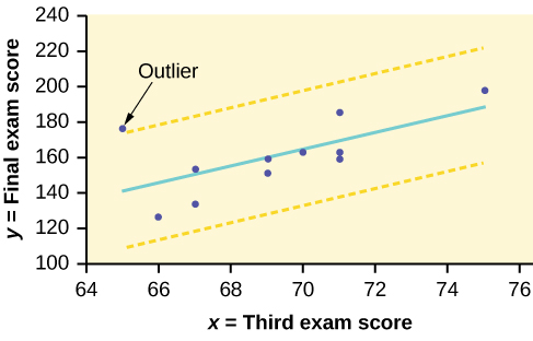
With the TI-83, 83+, 84+ graphing calculators, it is easy to identify the outliers graphically and visually. If we were to measure the vertical distance from any data point to the corresponding point on the line of best fit and that distance were equal to 2s or more, then we would consider the data point to be “too far” from the line of best fit. We need to find and graph the lines that are two standard deviations below and above the regression line. Any points that are outside these two lines are outliers. We will call these lines Y2 and Y3.
As we did with the equation of the regression line and the correlation coefficient, we will use technology to calculate this standard deviation for us. Using the LinRegTTest with this data, scroll down through the output screens to find s = 16.412.
Line Y2 = –173.5 + 4.83x –2(16.4) and line Y3 = –173.5 + 4.83x + 2(16.4)
where ŷ = –173.5 + 4.83x is the line of best fit. Y2 and Y3 have the same slope as the line of best fit.
Graph the scatter plot with the best fit line in equation Y1, then enter the two extra lines as Y2 and Y3 in the “Y=” equation editor and press ZOOM 9. You will find that the only data point that is not between lines Y2 and Y3 is the point x = 65, y = 175. On the calculator screen, it is just barely outside these lines. The outlier is the student who had a grade of 65 on the third exam and 175 on the final exam; this point is farther than two standard deviations away from the best-fit line.
Sometimes a point is so close to the lines used to flag outliers on the graph that it is difficult to tell if the point is between or outside the lines. On a computer, enlarging the graph may help; on a small calculator screen, zooming in may make the graph clearer. Note that when the graph does not give a clear enough picture, you can use the numerical comparisons to identify outliers.
Try It
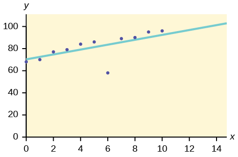
Identify the potential outlier in the scatter plot. The standard deviation of the residuals or errors is approximately 8.6.
Solution
The outlier appears to be at (6, 58). The expected y value on the line for the point (6, 58) is approximately 82. Fifty-eight is 24 units from 82. Twenty-four is more than two standard deviations (2s = (2)(8.6) = 17.2). So 82 is more than two standard deviations from 58, which makes (6, 58) a potential outlier.
Numerical Identification of Outliers
In [link], the first two columns are the third-exam and final-exam data. The third column shows the predicted ŷ values calculated from the line of best fit: ŷ = –173.5 + 4.83x. The residuals, or errors, have been calculated in the fourth column of the table: observed y value−predicted y value = y − ŷ.
s is the standard deviation of all the y − ŷ = ε values where n = the total number of data points. If each residual is calculated and squared, and the results are added, we get the SSE. The standard deviation of the residuals is calculated from the SSE as:
[latex]s=\sqrt{\frac{SSE}{n-2}}[/latex]
Note
We divide by (n – 2) because the regression model involves two estimates.
Rather than calculate the value of s ourselves, we can find s using the computer or calculator. For this example, the calculator function LinRegTTest found s = 16.4 as the standard deviation of the residuals 35–1716–6–1993–1–10–9–1.
| x | y | ŷ | y – ŷ |
|---|---|---|---|
| 65 | 175 | 140 | 175 – 140 = 35 |
| 67 | 133 | 150 | 133 – 150= –17 |
| 71 | 185 | 169 | 185 – 169 = 16 |
| 71 | 163 | 169 | 163 – 169 = –6 |
| 66 | 126 | 145 | 126 – 145 = –19 |
| 75 | 198 | 189 | 198 – 189 = 9 |
| 67 | 153 | 150 | 153 – 150 = 3 |
| 70 | 163 | 164 | 163 – 164 = –1 |
| 71 | 159 | 169 | 159 – 169 = –10 |
| 69 | 151 | 160 | 151 – 160 = –9 |
| 69 | 159 | 160 | 159 – 160 = –1 |
We are looking for all data points for which the residual is greater than 2s = 2(16.4) = 32.8 or less than –32.8. Compare these values to the residuals in column four of the table. The only such data point is the student who had a grade of 65 on the third exam and 175 on the final exam; the residual for this student is 35.
How Does the Outlier Affect the Best Fit Line?
Numerically and graphically, we have identified the point (65, 175) as an outlier. We should re-examine the data for this point to see if there are any problems with the data. If there is an error, we should fix the error if possible, or delete the data. If the data is correct, we would leave it in the data set. For this problem, we will suppose that we examined the data and found that this outlier data was an error. Therefore we will continue on and delete the outlier, so that we can explore how it affects the results, as a learning experience.
Compute a new best-fit line and correlation coefficient using the ten remaining points:
On the TI-83, TI-83+, TI-84+ calculators, delete the outlier from L1 and L2. Using the LinRegTTest, the new line of best fit and the correlation coefficient are:
ŷ = –355.19 + 7.39x and r = 0.9121
The new line with r = 0.9121 is a stronger correlation than the original (r = 0.6631) because r = 0.9121 is closer to one. This means that the new line is a better fit to the ten remaining data values. The line can better predict the final exam score given the third exam score.
Numerical Identification of Outliers: Calculating s and Finding Outliers Manually
If you do not have the function LinRegTTest, then you can calculate the outlier in the first example by doing the following.
First, square each |y – ŷ|
The squares are 352172162621929232121029212
Then, add (sum) all the |y – ŷ| squared terms using the formula
[latex]\stackrel{11}{\underset{i = 1}{\Sigma }}{\left(|{y}_{i}-{\stackrel{^}{y}}_{i}|\right)}^{2}=\stackrel{11}{\underset{i = 1}{\Sigma }}{\epsilon }_{i}{}^{2}[/latex] (Recall that yi – ŷi = εi.)
= 352 + 172 + 162 + 62 + 192 + 92 + 32 + 12 + 102 + 92 + 12
= 2440 = SSE. The result, SSE, is the Sum of Squared Errors.
Next, calculate s, the standard deviation of all the y – ŷ = ε values where n = the total number of data points.
The calculation is [latex]s=\sqrt{\frac{\text{SSE}}{n–2}}[/latex].
For the third exam/final exam problem, [latex]s=\sqrt{\frac{2440}{11–2}}=16.47[/latex].
Next, multiply s by 2:
(2)(16.47) = 32.94
32.94 is 2 standard deviations away from the mean of the y – ŷ values.
If we were to measure the vertical distance from any data point to the corresponding point on the line of best fit and that distance is at least 2s, then we would consider the data point to be “too far” from the line of best fit. We call that point a potential outlier.
For the example, if any of the |y – ŷ| values are at least 32.94, the corresponding (x, y) data point is a potential outlier.
For the third exam/final exam problem, all the |y – ŷ|’s are less than 31.29 except for the first one which is 35.
35 > 31.29 That is, |y – ŷ| ≥ (2)(s)
The point which corresponds to |y – ŷ| = 35 is (65, 175). Therefore, the data point (65,175) is a potential outlier. For this example, we will delete it. (Remember, we do not always delete an outlier.)
Note
When outliers are deleted, the researcher should either record that data was deleted, and why, or the researcher should provide results both with and without the deleted data. If data is erroneous and the correct values are known (e.g., student one actually scored a 70 instead of a 65), then this correction can be made to the data.
The next step is to compute a new best-fit line using the ten remaining
points. The new line of best fit and the correlation coefficient are:
ŷ = –355.19 + 7.39x and r = 0.9121
Example
Using this new line of best fit (based on the remaining ten data points in the third exam/final exam example), what would a student who receives a 73 on the third exam expect to receive on the final exam? Is this the same as the prediction made using the original line?
Solution
Using the new line of best fit, ŷ = –355.19 + 7.39(73) = 184.28. A student who scored 73 points on the third exam would expect to earn 184 points on the final exam.
The original line predicted ŷ = –173.51 + 4.83(73) = 179.08 so the prediction using the new line with the outlier eliminated differs from the original prediction.
Try It
The data points for the graph from the third exam/final exam example are as follows: (1, 5), (2, 7), (2, 6), (3, 9), (4, 12), (4, 13), (5, 18), (6, 19), (7, 12), and (7, 21). Remove the outlier and recalculate the line of best fit. Find the value of ŷ when x = 10.
Solution
ŷ = 1.04 + 2.96x; 30.64
Example
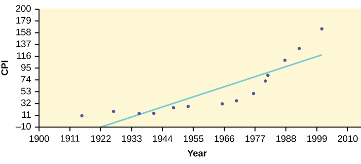
The Consumer Price Index (CPI) measures the average change over time in the prices paid by urban consumers for consumer goods and services. The CPI affects nearly all Americans because of the many ways it is used. One of its biggest uses is as a measure of inflation. By providing information about price changes in the Nation’s economy to government, business, and labor, the CPI helps them to make economic decisions. The president, Congress, and the Federal Reserve Board use the CPI’s trends to formulate monetary and fiscal policies. In the following table, x is the year and y is the CPI.
| x | y | x | y |
|---|---|---|---|
| 1915 | 10.1 | 1969 | 36.7 |
| 1926 | 17.7 | 1975 | 49.3 |
| 1935 | 13.7 | 1979 | 72.6 |
| 1940 | 14.7 | 1980 | 82.4 |
| 1947 | 24.1 | 1986 | 109.6 |
| 1952 | 26.5 | 1991 | 130.7 |
| 1964 | 31.0 | 1999 | 166.6 |
- Draw a scatter plot of the data.
- Calculate the least squares line. Write the equation in the form ŷ = a + bx.
- Draw the line on the scatter plot.
- Find the correlation coefficient. Is it significant?
- What is the average CPI for the year 1990?
Solution
- See [link].
- ŷ = –3204 + 1.662x is the equation of the line of best fit.
- r = 0.8694
- The number of data points is n = 14. Use the 95% Critical Values of the Sample Correlation Coefficient table at the end of Chapter 12. n – 2 = 12. The corresponding critical value is 0.532. Since 0.8694 > 0.532, r is significant.
ŷ = –3204 + 1.662(1990) = 103.4 CPI
- Using the calculator LinRegTTest, we find that s = 25.4; graphing the lines Y2 = –3204 + 1.662X – 2(25.4) and Y3 = –3204 + 1.662X + 2(25.4) shows that no data values are outside those lines, identifying no outliers. (Note that the year 1999 was very close to the upper line, but still inside it.)
Note
In the example, notice the pattern of the points compared to the line. Although the correlation coefficient is significant, the pattern in the scatter plot indicates that a curve would be a more appropriate model to use than a line. In this example, a statistician should prefer to use other methods to fit a curve to this data, rather than model the data with the line we found. In addition to doing the calculations, it is always important to look at the scatter plot when deciding whether a linear model is appropriate.
If you are interested in seeing more years of data, visit the Bureau of Labor Statistics CPI website ftp://ftp.bls.gov/pub/special.requests/cpi/cpiai.txt; our data is taken from the column entitled “Annual Avg.” (third column from the right). For example you could add more current years of data. Try adding the more recent years: 2004: CPI = 188.9; 2008: CPI = 215.3; 2011: CPI = 224.9. See how it affects the model. (Check: ŷ = –4436 + 2.295x; r = 0.9018. Is r significant? Is the fit better with the addition of the new points?)
Try It
The following table shows economic development measured in per capita income PCINC.
| Year | PCINC | Year | PCINC |
|---|---|---|---|
| 1870 | 340 | 1920 | 1050 |
| 1880 | 499 | 1930 | 1170 |
| 1890 | 592 | 1940 | 1364 |
| 1900 | 757 | 1950 | 1836 |
| 1910 | 927 | 1960 | 2132 |
- What are the independent and dependent variables?
- Draw a scatter plot.
- Use regression to find the line of best fit and the correlation coefficient.
- Interpret the significance of the correlation coefficient.
- Is there a linear relationship between the variables?
- Find the coefficient of determination and interpret it.
- What is the slope of the regression equation? What does it mean?
- Use the line of best fit to estimate PCINC for 1900, for 2000.
- Determine if there are any outliers.
Solution
a. The independent variable (x) is the year and the dependent variable (y) is the per capita income.
b.

c. ŷ = 18.61x – 34574; r = 0.9732
d. At df = 8, the critical value is 0.632. The r value is significant because it is greater than the critical value.
e. There does appear to be a linear relationship between the variables.
f. The coefficient of determination is 0.947, which means that 94.7% of the variation in PCINC is explained by the variation in the years.
g. and h. The slope of the regression equation is 18.61, and it means that per capita income increases by 💲18.61 for each passing year. ŷ = 785 when the year is 1900, and ŷ = 2,646 when the year is 2000.
i. There do not appear to be any outliers.
95% Critical Values of the Sample Correlation Coefficient Table
| Degrees of Freedom: n – 2 | Critical Values: (+ and –) |
|---|---|
| 1 | 0.997 |
| 2 | 0.950 |
| 3 | 0.878 |
| 4 | 0.811 |
| 5 | 0.754 |
| 6 | 0.707 |
| 7 | 0.666 |
| 8 | 0.632 |
| 9 | 0.602 |
| 10 | 0.576 |
| 11 | 0.555 |
| 12 | 0.532 |
| 13 | 0.514 |
| 14 | 0.497 |
| 15 | 0.482 |
| 16 | 0.468 |
| 17 | 0.456 |
| 18 | 0.444 |
| 19 | 0.433 |
| 20 | 0.423 |
| 21 | 0.413 |
| 22 | 0.404 |
| 23 | 0.396 |
| 24 | 0.388 |
| 25 | 0.381 |
| 26 | 0.374 |
| 27 | 0.367 |
| 28 | 0.361 |
| 29 | 0.355 |
| 30 | 0.349 |
| 40 | 0.304 |
| 50 | 0.273 |
| 60 | 0.250 |
| 70 | 0.232 |
| 80 | 0.217 |
| 90 | 0.205 |
| 100 | 0.195 |
References
Data from the House Ways and Means Committee, the Health and Human Services Department.
Data from Microsoft Bookshelf.
Data from the United States Department of Labor, the Bureau of Labor Statistics.
Data from the Physician’s Handbook, 1990.
Data from the United States Department of Labor, the Bureau of Labor Statistics.
an observation that does not fit the rest of the data
