Chapter 2: Descriptive Statistics
Chapter 2 Homework
Homework from 2.1
Student grades on a chemistry exam were: 77, 78, 76, 81, 86, 51, 79, 82, 84, 99
- Construct a stem-and-leaf plot of the data.
- Are there any potential outliers? If so, which scores are they? Why do you consider them outliers?
[link] contains the 2010 obesity rates in U.S. states and Washington, DC.
| State | Percent (%) | State | Percent (%) | State | Percent (%) |
|---|---|---|---|---|---|
| Alabama | 32.2 | Kentucky | 31.3 | North Dakota | 27.2 |
| Alaska | 24.5 | Louisiana | 31.0 | Ohio | 29.2 |
| Arizona | 24.3 | Maine | 26.8 | Oklahoma | 30.4 |
| Arkansas | 30.1 | Maryland | 27.1 | Oregon | 26.8 |
| California | 24.0 | Massachusetts | 23.0 | Pennsylvania | 28.6 |
| Colorado | 21.0 | Michigan | 30.9 | Rhode Island | 25.5 |
| Connecticut | 22.5 | Minnesota | 24.8 | South Carolina | 31.5 |
| Delaware | 28.0 | Mississippi | 34.0 | South Dakota | 27.3 |
| Washington, DC | 22.2 | Missouri | 30.5 | Tennessee | 30.8 |
| Florida | 26.6 | Montana | 23.0 | Texas | 31.0 |
| Georgia | 29.6 | Nebraska | 26.9 | Utah | 22.5 |
| Hawaii | 22.7 | Nevada | 22.4 | Vermont | 23.2 |
| Idaho | 26.5 | New Hampshire | 25.0 | Virginia | 26.0 |
| Illinois | 28.2 | New Jersey | 23.8 | Washington | 25.5 |
| Indiana | 29.6 | New Mexico | 25.1 | West Virginia | 32.5 |
| Iowa | 28.4 | New York | 23.9 | Wisconsin | 26.3 |
| Kansas | 29.4 | North Carolina | 27.8 | Wyoming | 25.1 |
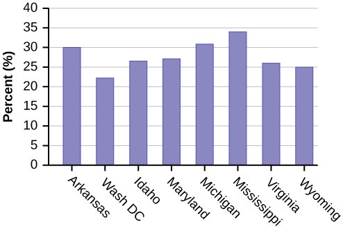
- Use a random number generator to randomly pick eight states. Construct a bar graph of the obesity rates of those eight states.
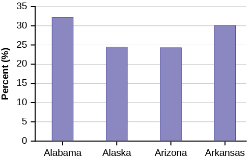
- Construct a bar graph for all the states beginning with the letter “A.”
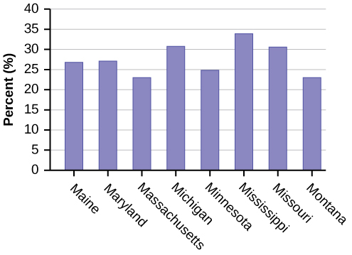
- Construct a bar graph for all the states beginning with the letter “M.”
Solution
- Example solution for using the random number generator for the TI-84+ to generate a simple random sample of 8 states. Instructions are as follows.
- Number the entries in the table 1–51 (Includes Washington, DC; Numbered vertically)
- Press MATH
- Arrow over to PRB
- Press 5:randInt(
- Enter 51,1,8)
Eight numbers are generated (use the right arrow key to scroll through the numbers). The numbers correspond to the numbered states (for this example: {47 21 9 23 51 13 25 4}. If any numbers are repeated, generate a different number by using 5:randInt(51,1)). Here, the states (and Washington DC) are {Arkansas, Washington DC, Idaho, Maryland, Michigan, Mississippi, Virginia, Wyoming}.
Corresponding percentages are {30.1, 22.2, 26.5, 27.1, 30.9, 34.0, 26.0, 25.1}.
-
-
Homework from 2.2
Suppose that three book publishers were interested in the number of fiction paperbacks adult consumers purchase per month. Each publisher conducted a survey. In the survey, adult consumers were asked the number of fiction paperbacks they had purchased the previous month. The results are as follows:
| # of books | Freq. | Rel. Freq. |
|---|---|---|
| 0 | 10 | |
| 1 | 12 | |
| 2 | 16 | |
| 3 | 12 | |
| 4 | 8 | |
| 5 | 6 | |
| 6 | 2 | |
| 8 | 2 |
| # of books | Freq. | Rel. Freq. |
|---|---|---|
| 0 | 18 | |
| 1 | 24 | |
| 2 | 24 | |
| 3 | 22 | |
| 4 | 15 | |
| 5 | 10 | |
| 7 | 5 | |
| 9 | 1 |
| # of books | Freq. | Rel. Freq. |
|---|---|---|
| 0–1 | 20 | |
| 2–3 | 35 | |
| 4–5 | 12 | |
| 6–7 | 2 | |
| 8–9 | 1 |
- Find the relative frequencies for each survey. Write them in the charts.
- Using either a graphing calculator, computer, or by hand, use the frequency column to construct a histogram for each publisher’s survey. For Publishers A and B, make bar widths of one. For Publisher C, make bar widths of two.
- In complete sentences, give two reasons why the graphs for Publishers A and B are not identical.
- Would you have expected the graph for Publisher C to look like the other two graphs? Why or why not?
- Make new histograms for Publisher A and Publisher B. This time, make bar widths of two.
- Now, compare the graph for Publisher C to the new graphs for Publishers A and B. Are the graphs more similar or more different? Explain your answer.
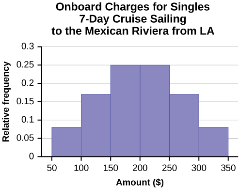
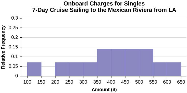
Often, cruise ships conduct all on-board transactions, with the exception of gambling, on a cashless basis. At the end of the cruise, guests pay one bill that covers all onboard transactions. Suppose that 60 single travelers and 70 couples were surveyed as to their on-board bills for a seven-day cruise from Los Angeles to the Mexican Riviera. Following is a summary of the bills for each group.
| Amount(💲) | Frequency | Rel. Frequency |
|---|---|---|
| 51–100 | 5 | |
| 101–150 | 10 | |
| 151–200 | 15 | |
| 201–250 | 15 | |
| 251–300 | 10 | |
| 301–350 | 5 |
| Amount(💲) | Frequency | Rel. Frequency |
|---|---|---|
| 100–150 | 5 | |
| 201–250 | 5 | |
| 251–300 | 5 | |
| 301–350 | 5 | |
| 351–400 | 10 | |
| 401–450 | 10 | |
| 451–500 | 10 | |
| 501–550 | 10 | |
| 551–600 | 5 | |
| 601–650 | 5 |
- Fill in the relative frequency for each group.
- Construct a histogram for the singles group. Scale the x-axis by 💲50 widths. Use relative frequency on the y-axis.
- Construct a histogram for the couples group. Scale the x-axis by 💲50 widths. Use relative frequency on the y-axis.
- Compare the two graphs:
- List two similarities between the graphs.
- List two differences between the graphs.
- Overall, are the graphs more similar or different?
- Construct a new graph for the couples by hand. Since each couple is paying for two individuals, instead of scaling the x-axis by 💲50, scale it by 💲100. Use relative frequency on the y-axis.
- Compare the graph for the singles with the new graph for the couples:
- List two similarities between the graphs.
- Overall, are the graphs more similar or different?
- How did scaling the couples graph differently change the way you compared it to the singles graph?
- Based on the graphs, do you think that individuals spend the same amount, more or less, as singles as they do person by person as a couple? Explain why in one or two complete sentences.
Solution
| Amount(💲) | Frequency | Relative Frequency |
|---|---|---|
| 51–100 | 5 | 0.08 |
| 101–150 | 10 | 0.17 |
| 151–200 | 15 | 0.25 |
| 201–250 | 15 | 0.25 |
| 251–300 | 10 | 0.17 |
| 301–350 | 5 | 0.08 |
| Amount(💲) | Frequency | Relative Frequency |
|---|---|---|
| 100–150 | 5 | 0.07 |
| 201–250 | 5 | 0.07 |
| 251–300 | 5 | 0.07 |
| 301–350 | 5 | 0.07 |
| 351–400 | 10 | 0.14 |
| 401–450 | 10 | 0.14 |
| 451–500 | 10 | 0.14 |
| 501–550 | 10 | 0.14 |
| 551–600 | 5 | 0.07 |
| 601–650 | 5 | 0.07 |
- See [link] and [link].
- In the following histogram data values that fall on the right boundary are counted in the class interval, while values that fall on the left boundary are not counted (with the exception of the first interval where both boundary values are included).
- In the following histogram, the data values that fall on the right boundary are counted in the class interval, while values that fall on the left boundary are not counted (with the exception of the first interval where values on both boundaries are included).
- Compare the two graphs:
- Answers may vary. Possible answers include:
- Both graphs have a single peak.
- Both graphs use class intervals with width equal to 💲50.
- Answers may vary. Possible answers include:
- The couples graph has a class interval with no values.
- It takes almost twice as many class intervals to display the data for couples.
- Answers may vary. Possible answers include: The graphs are more similar than different because the overall patterns for the graphs are the same.
- Answers may vary. Possible answers include:
- Check student’s solution.
- Compare the graph for the Singles with the new graph for the Couples:
-
- Both graphs have a single peak.
- Both graphs display 6 class intervals.
- Both graphs show the same general pattern.
- Answers may vary. Possible answers include: Although the width of the class intervals for couples is double that of the class intervals for singles, the graphs are more similar than they are different.
- Answers may vary. Possible answers include: You are able to compare the graphs interval by interval. It is easier to compare the overall patterns with the new scale on the Couples graph. Because a couple represents two individuals, the new scale leads to a more accurate comparison.
- Answers may vary. Possible answers include: Based on the histograms, it seems that spending does not vary much from singles to individuals who are part of a couple. The overall patterns are the same. The range of spending for couples is approximately double the range for individuals.
-
Twenty-five randomly selected students were asked the number of movies they watched the previous week. The results are as follows.
| # of movies | Frequency | Relative Frequency | Cumulative Relative Frequency |
|---|---|---|---|
| 0 | 5 | ||
| 1 | 9 | ||
| 2 | 6 | ||
| 3 | 4 | ||
| 4 | 1 |
- Construct a histogram of the data.
- Complete the columns of the chart.
Use the following information to answer the next two exercises: Suppose one hundred eleven people who shopped in a special T-shirt store were asked the number of T-shirts they own costing more than 💲19 each.
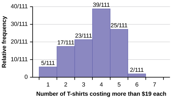
The percentage of people who own at most three T-shirts costing more than 💲19 each is approximately:
- 21
- 59
- 41
- Cannot be determined
Solution
c
If the data were collected by asking the first 111 people who entered the store, then the type of sampling is:
- cluster
- simple random
- stratified
- convenience
Following are the 2010 obesity rates by U.S. states and Washington, DC.
| State | Percent (%) | State | Percent (%) | State | Percent (%) |
|---|---|---|---|---|---|
| Alabama | 32.2 | Kentucky | 31.3 | North Dakota | 27.2 |
| Alaska | 24.5 | Louisiana | 31.0 | Ohio | 29.2 |
| Arizona | 24.3 | Maine | 26.8 | Oklahoma | 30.4 |
| Arkansas | 30.1 | Maryland | 27.1 | Oregon | 26.8 |
| California | 24.0 | Massachusetts | 23.0 | Pennsylvania | 28.6 |
| Colorado | 21.0 | Michigan | 30.9 | Rhode Island | 25.5 |
| Connecticut | 22.5 | Minnesota | 24.8 | South Carolina | 31.5 |
| Delaware | 28.0 | Mississippi | 34.0 | South Dakota | 27.3 |
| Washington, DC | 22.2 | Missouri | 30.5 | Tennessee | 30.8 |
| Florida | 26.6 | Montana | 23.0 | Texas | 31.0 |
| Georgia | 29.6 | Nebraska | 26.9 | Utah | 22.5 |
| Hawaii | 22.7 | Nevada | 22.4 | Vermont | 23.2 |
| Idaho | 26.5 | New Hampshire | 25.0 | Virginia | 26.0 |
| Illinois | 28.2 | New Jersey | 23.8 | Washington | 25.5 |
| Indiana | 29.6 | New Mexico | 25.1 | West Virginia | 32.5 |
| Iowa | 28.4 | New York | 23.9 | Wisconsin | 26.3 |
| Kansas | 29.4 | North Carolina | 27.8 | Wyoming | 25.1 |
Construct a bar graph of obesity rates of your state and the four states closest to your state. Hint: Label the x-axis with the states.
Solution
Answers will vary.
Homework from 2.3
The median age for U.S. blacks currently is 30.9 years; for U.S. whites it is 42.3 years.
Six hundred adult Americans were asked by telephone poll, “What do you think constitutes a middle-class income?” The results are in [link]. Also, include left endpoint, but not the right endpoint.
| Salary (💲) | Relative Frequency |
|---|---|
| < 20,000 | 0.02 |
| 20,000–25,000 | 0.09 |
| 25,000–30,000 | 0.19 |
| 30,000–40,000 | 0.26 |
| 40,000–50,000 | 0.18 |
| 50,000–75,000 | 0.17 |
| 75,000–99,999 | 0.02 |
| 100,000+ | 0.01 |
- What percentage of the survey answered “not sure”?
- What percentage think that middle-class is from 💲25,000 to 💲50,000?
- Construct a histogram of the data.
- Should all bars have the same width, based on the data? Why or why not?
- How should the <20,000 and the 100,000+ intervals be handled? Why?
- Find the 40th and 80th percentiles
- Construct a bar graph of the data
Solution
- 1 – (0.02+0.09+0.19+0.26+0.18+0.17+0.02+0.01) = 0.06
- 0.19+0.26+0.18 = 0.63
- Check student’s solution.
-
40th percentile will fall between 30,000 and 40,000
80th percentile will fall between 50,000 and 75,000
- Check student’s solution.
Given the following box plot:
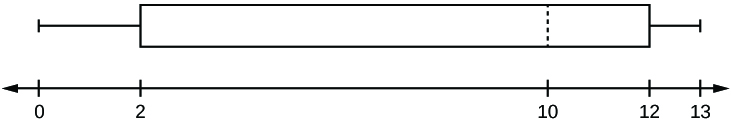
- which quarter has the smallest spread of data? What is that spread?
- which quarter has the largest spread of data? What is that spread?
- find the interquartile range (IQR).
- are there more data in the interval 5–10 or in the interval 10–13? How do you know this?
- which interval has the fewest data in it? How do you know this?
- 0–2
- 2–4
- 10–12
- 12–13
- need more information
The following box plot shows the U.S. population for 1990, the latest available year.
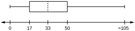
- Are there fewer or more children (age 17 and under) than senior citizens (age 65 and over)? How do you know?
- 12.6% are age 65 and over. Approximately what percentage of the population are working age adults (above age 17 to age 65)?
Solution
- more children; the left whisker shows that 25% of the population are children 17 and younger. The right whisker shows that 25% of the population are adults 50 and older, so adults 65 and over represent less than 25%.
- 62.4%
Homework from 2.4
In a survey of 20-year-olds in China, Germany, and the United States, people were asked the number of foreign countries they had visited in their lifetime. The following box plots display the results.
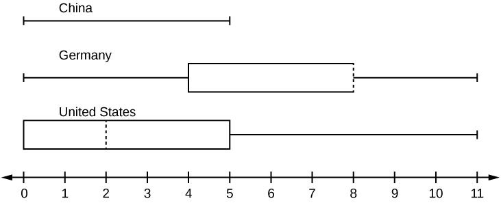
- In complete sentences, describe what the shape of each box plot implies about the distribution of the data collected.
- Have more Americans or more Germans surveyed been to over eight foreign countries?
- Compare the three box plots. What do they imply about the foreign travel of 20-year-old residents of the three countries when compared to each other?
Given the following box plot, answer the questions.
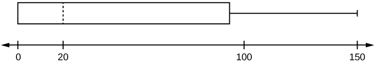
- Think of an example (in words) where the data might fit into the above box plot. In 2–5 sentences, write down the example.
- What does it mean to have the first and second quartiles so close together, while the second to third quartiles are far apart?
Solution
- Answers will vary. Possible answer: State University conducted a survey to see how involved its students are in community service. The box plot shows the number of community service hours logged by participants over the past year.
- Because the first and second quartiles are close, the data in this quarter is very similar. There is not much variation in the values. The data in the third quarter is much more variable or spread out. This is clear because the second quartile is so far away from the third quartile.
Given the following box plots, answer the questions.
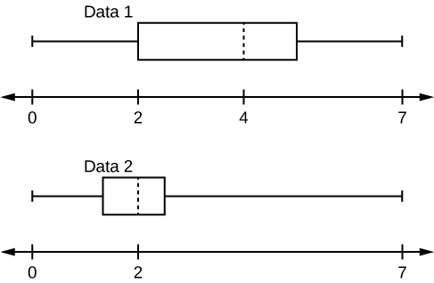
- In complete sentences, explain why each statement is false.
- Data 1 has more data values above two than Data 2 has above two.
- The data sets cannot have the same mode.
- For Data 1, there are more data values below four than there are above four.
- For which group, Data 1 or Data 2, is the value of “7” more likely to be an outlier? Explain why in complete sentences.
A survey was conducted of 130 purchasers of new BMW 3 series cars, 130 purchasers of new BMW 5 series cars, and 130 purchasers of new BMW 7 series cars. In it, people were asked the age they were when they purchased their car. The following box plots display the results.
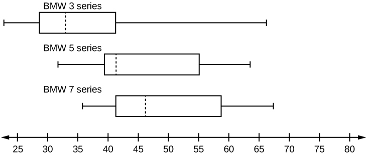
- In complete sentences, describe what the shape of each box plot implies about the distribution of the data collected for that car series.
- Which group is most likely to have an outlier? Explain how you determined that.
- Compare the three box plots. What do they imply about the age of purchasing a BMW from the series when compared to each other?
- Look at the BMW 5 series. Which quarter has the smallest spread of data? What is the spread?
- Look at the BMW 5 series. Which quarter has the largest spread of data? What is the spread?
- Look at the BMW 5 series. Estimate the interquartile range (IQR).
- Look at the BMW 5 series. Are there more data in the interval 31 to 38 or in the interval 45 to 55? How do you know this?
- Look at the BMW 5 series. Which interval has the fewest data in it? How do you know this?
- 31–35
- 38–41
- 41–64
Solution
- Each box plot is spread out more in the greater values. Each plot is skewed to the right, so the ages of the top 50% of buyers are more variable than the ages of the lower 50%.
- The BMW 3 series is most likely to have an outlier. It has the longest whisker.
- Comparing the median ages, younger people tend to buy the BMW 3 series, while older people tend to buy the BMW 7 series. However, this is not a rule, because there is so much variability in each data set.
- The second quarter has the smallest spread. There seems to be only a three-year difference between the first quartile and the median.
- The third quarter has the largest spread. There seems to be approximately a 14-year difference between the median and the third quartile.
- IQR ~ 17 years
- There is not enough information to tell. Each interval lies within a quarter, so we cannot tell exactly where the data in that quarter is concentrated.
- The interval from 31 to 35 years has the fewest data values. Twenty-five percent of the values fall in the interval 38 to 41, and 25% fall between 41 and 64. Since 25% of values fall between 31 and 38, we know that fewer than 25% fall between 31 and 35.
Twenty-five randomly selected students were asked the number of movies they watched the previous week. The results are as follows:
| # of movies | Frequency |
|---|---|
| 0 | 5 |
| 1 | 9 |
| 2 | 6 |
| 3 | 4 |
| 4 | 1 |
Construct a box plot of the data.
Homework from 2.5
The most obese countries in the world have obesity rates that range from 11.4% to 74.6%. This data is summarized in the following table.
| Percent of Population Obese | Number of Countries |
|---|---|
| 11.4–20.45 | 29 |
| 20.45–29.45 | 13 |
| 29.45–38.45 | 4 |
| 38.45–47.45 | 0 |
| 47.45–56.45 | 2 |
| 56.45–65.45 | 1 |
| 65.45–74.45 | 0 |
| 74.45–83.45 | 1 |
- What is the best estimate of the average obesity percentage for these countries?
- The United States has an average obesity rate of 33.9%. Is this rate above average or below?
- How does the United States compare to other countries?
[link] gives the percent of children under five considered to be underweight. What is the best estimate for the mean percentage of underweight children?
| Percent of Underweight Children | Number of Countries |
|---|---|
| 16–21.45 | 23 |
| 21.45–26.9 | 4 |
| 26.9–32.35 | 9 |
| 32.35–37.8 | 7 |
| 37.8–43.25 | 6 |
| 43.25–48.7 | 1 |
Solution
The mean percentage, [latex]\overline{x}=\frac{1328.65}{50}=26.75[/latex]
Homework from 2.6
The median age of the U.S. population in 1980 was 30.0 years. In 1991, the median age was 33.1 years.
- What does it mean for the median age to rise?
- Give two reasons why the median age could rise.
- For the median age to rise, is the actual number of children less in 1991 than it was in 1980? Why or why not?
Homework from 2.7
Use the following information to answer the next nine exercises: The population parameters below describe the full-time equivalent number of students (FTES) each year at Lake Tahoe Community College from 1976–1977 through 2004–2005.
- μ = 1000 FTES
- median = 1,014 FTES
- σ = 474 FTES
- first quartile = 528.5 FTES
- third quartile = 1,447.5 FTES
- n = 29 years
A sample of 11 years is taken. About how many are expected to have a FTES of 1014 or above? Explain how you determined your answer.
Solution
The median value is the middle value in the ordered list of data values. The median value of a set of 11 will be the 6th number in order. Six years will have totals at or below the median.
75% of all years have an FTES:
The population standard deviation = _____
Solution
474 FTES
What percentage of the FTES was from 528.5 to 1447.5? How do you know?
What is the IQR? What does the IQR represent?
Solution
919
How many standard deviations away from the mean is the median?
Additional Information: The population FTES for 2005–2006 through 2010–2011 was given in an updated report. The data are reported here.
| Year | 2005–6 | 2006–7 | 2007–8 | 2008–9 | 2009–10 | 2010–11 |
| Total FTES | 1,585 | 1,690 | 1,735 | 1,935 | 2,021 | 1,890 |
Calculate the mean, median, standard deviation, the first quartile, the third quartile and the IQR. Round to one decimal place.
Solution
- mean = 1,809.3
- median = 1,812.5
- standard deviation = 151.2
- first quartile = 1,690
- third quartile = 1,935
- IQR = 245
Construct a box plot for the FTES for 2005–2006 through 2010–2011 and a box plot for the FTES for 1976–1977 through 2004–2005.
Compare the IQR for the FTES for 1976–77 through 2004–2005 with the IQR for the FTES for 2005-2006 through 2010–2011. Why do you suppose the IQRs are so different?
Solution
Hint: Think about the number of years covered by each time period and what happened to higher education during those periods.
Three students were applying to the same graduate school. They came from schools with different grading systems. Which student had the best GPA when compared to other students at his school? Explain how you determined your answer.
| Student | GPA | School Average GPA | School Standard Deviation |
|---|---|---|---|
| Thuy | 2.7 | 3.2 | 0.8 |
| Vichet | 87 | 75 | 20 |
| Kamala | 8.6 | 8 | 0.4 |
A music school has budgeted to purchase three musical instruments. They plan to purchase a piano costing 💲3,000, a guitar costing 💲550, and a drum set costing 💲600. The mean cost for a piano is 💲4,000 with a standard deviation of 💲2,500. The mean cost for a guitar is 💲500 with a standard deviation of 💲200. The mean cost for drums is 💲700 with a standard deviation of 💲100. Which cost is the lowest, when compared to other instruments of the same type? Which cost is the highest when compared to other instruments of the same type. Justify your answer.
Solution
For pianos, the cost of the piano is 0.4 standard deviations BELOW the mean. For guitars, the cost of the guitar is 0.25 standard deviations ABOVE the mean. For drums, the cost of the drum set is 1.0 standard deviations BELOW the mean. Of the three, the drums cost the lowest in comparison to the cost of other instruments of the same type. The guitar costs the most in comparison to the cost of other instruments of the same type.
An elementary school class ran one mile with a mean of 11 minutes and a standard deviation of three minutes. Rachel, a student in the class, ran one mile in eight minutes. A junior high school class ran one mile with a mean of nine minutes and a standard deviation of two minutes. Kenji, a student in the class, ran 1 mile in 8.5 minutes. A high school class ran one mile with a mean of seven minutes and a standard deviation of four minutes. Nedda, a student in the class, ran one mile in eight minutes.
- Why is Kenji considered a better runner than Nedda, even though Nedda ran faster than him?
- Who is the fastest runner with respect to his or her class? Explain why.
The most obese countries in the world have obesity rates that range from 11.4% to 74.6%. This data is summarized in Table 14.
| Percent of Population Obese | Number of Countries |
|---|---|
| 11.4–20.45 | 29 |
| 20.45–29.45 | 13 |
| 29.45–38.45 | 4 |
| 38.45–47.45 | 0 |
| 47.45–56.45 | 2 |
| 56.45–65.45 | 1 |
| 65.45–74.45 | 0 |
| 74.45–83.45 | 1 |
What is the best estimate of the average obesity percentage for these countries? What is the standard deviation for the listed obesity rates? The United States has an average obesity rate of 33.9%. Is this rate above average or below? How “unusual” is the United States’ obesity rate compared to the average rate? Explain.
Solution
- [latex]\overline{x}=23.32[/latex]
- Using the TI 83/84, we obtain a standard deviation of: [latex]{s}_{x}=12.95.[/latex]
- The obesity rate of the United States is 10.58% higher than the average obesity rate.
- Since the standard deviation is 12.95, we see that 23.32 + 12.95 = 36.27 is the obesity percentage that is one standard deviation from the mean. The United States obesity rate is slightly less than one standard deviation from the mean. Therefore, we can assume that the United States, while 34% obese, does not have an unusually high percentage of obese people.
[link] gives the percent of children under five considered to be underweight.
| Percent of Underweight Children | Number of Countries |
|---|---|
| 16–21.45 | 23 |
| 21.45–26.9 | 4 |
| 26.9–32.35 | 9 |
| 32.35–37.8 | 7 |
| 37.8–43.25 | 6 |
| 43.25–48.7 | 1 |
What is the best estimate for the mean percentage of underweight children? What is the standard deviation? Which interval(s) could be considered unusual? Explain.
used to describe data that is not symmetrical; when the right side of a graph looks “chopped off” compared to the left side, we say it is “skewed to the left.” When the left side of the graph looks “chopped off” compared to the right side, we say the data is “skewed to the right.” Alternatively: when the lower values of the data are more spread out, we say the data are skewed to the left. When the greater values are more spread out, the data are skewed to the right.
