Chapter 2: Descriptive Statistics
Chapter 2 Review
Chapter Review from 2.1
A stem-and-leaf plot is a way to plot data and look at the distribution. In a stem-and-leaf plot, all data values within a class are visible. The advantage in a stem-and-leaf plot is that all values are listed, unlike a histogram, which gives classes of data values. A line graph is often used to represent a set of data values in which a quantity varies with time. These graphs are useful for finding trends. That is, finding a general pattern in data sets including temperature, sales, employment, company profit or cost over a period of time. A bar graph is a chart that uses either horizontal or vertical bars to show comparisons among categories. One axis of the chart shows the specific categories being compared, and the other axis represents a discrete value. Some bar graphs present bars clustered in groups of more than one (grouped bar graphs), and others show the bars divided into subparts to show cumulative effect (stacked bar graphs). Bar graphs are especially useful when categorical data is being used.
For each of the following data sets, create a stem plot and identify any outliers. The miles per gallon rating for 30 cars are shown below (lowest to highest).
19, 19, 19, 20, 21, 21, 25, 25, 25, 26, 26, 28, 29, 31, 31, 32, 32, 33, 34, 35, 36, 37, 37, 38, 38, 38, 38, 41, 43, 43
Solution
| Stem | Leaf |
|---|---|
| 1 | 9 9 9 |
| 2 | 0 1 1 5 5 5 6 6 8 9 |
| 3 | 1 1 2 2 3 4 5 6 7 7 8 8 8 8 |
| 4 | 1 3 3 |
The height in feet of 25 trees is shown below (lowest to highest).
25, 27, 33, 34, 34, 34, 35, 37, 37, 38, 39, 39, 39, 40, 41, 45, 46, 47, 49, 50, 50, 53, 53, 54, 54
The data are the prices of different laptops at an electronics store. Round each value to the nearest ten.
249, 249, 260, 265, 265, 280, 299, 299, 309, 319, 325, 326, 350, 350, 350, 365, 369, 389, 409, 459, 489, 559, 569, 570, 610
Solution
| Stem | Leaf |
|---|---|
| 2 | 5 5 6 7 7 8 |
| 3 | 0 0 1 2 3 3 5 5 5 7 7 9 |
| 4 | 1 6 9 |
| 5 | 6 7 7 |
| 6 | 1 |
The data are daily high temperatures in a town for one month.
61, 61, 62, 64, 66, 67, 67, 67, 68, 69, 70, 70, 70, 71, 71, 72, 74, 74, 74, 75, 75, 75, 76, 76, 77, 78, 78, 79, 79, 95
For the next three exercises, use the data to construct a line graph.
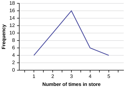
In a survey, 40 people were asked how many times they visited a store before making a major purchase. The results are shown in [link].
| Number of times in store | Frequency |
|---|---|
| 1 | 4 |
| 2 | 10 |
| 3 | 16 |
| 4 | 6 |
| 5 | 4 |
Solution
In a survey, several people were asked how many years it has been since they purchased a mattress. The results are shown in [link].
| Years since last purchase | Frequency |
|---|---|
| 0 | 2 |
| 1 | 8 |
| 2 | 13 |
| 3 | 22 |
| 4 | 16 |
| 5 | 9 |
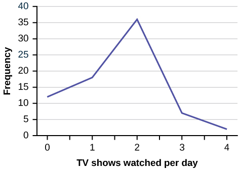
Several children were asked how many TV shows they watch each day. The results of the survey are shown in [link].
| Number of TV Shows | Frequency |
|---|---|
| 0 | 12 |
| 1 | 18 |
| 2 | 36 |
| 3 | 7 |
| 4 | 2 |
Solution
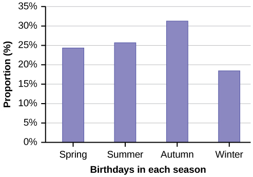
The students in Ms. Ramirez’s math class have birthdays in each of the four seasons. [link] shows the four seasons, the number of students who have birthdays in each season, and the percentage (%) of students in each group. Construct a bar graph showing the number of students.
| Seasons | Number of students | Proportion of population |
|---|---|---|
| Spring | 8 | 24% |
| Summer | 9 | 26% |
| Autumn | 11 | 32% |
| Winter | 6 | 18% |
Using the data from Mrs. Ramirez’s math class supplied in [link], construct a bar graph showing the percentages.
Solution
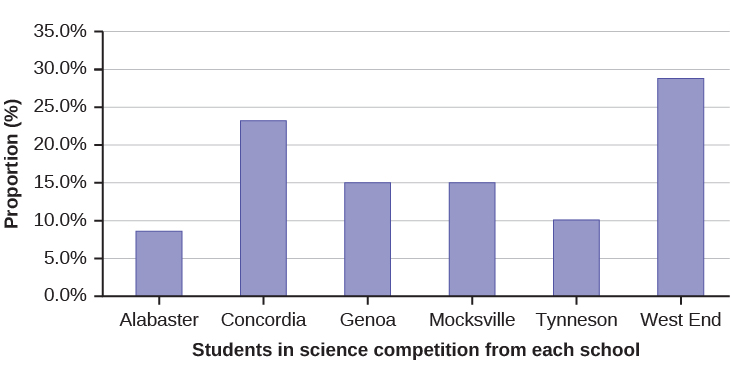
David County has six high schools. Each school sent students to participate in a county-wide science competition. [link] shows the percentage breakdown of competitors from each school, and the percentage of the entire student population of the county that goes to each school. Construct a bar graph that shows the population percentage of competitors from each school.
| High School | Science competition population | Overall student population |
|---|---|---|
| Alabaster | 28.9% | 8.6% |
| Concordia | 7.6% | 23.2% |
| Genoa | 12.1% | 15.0% |
| Mocksville | 18.5% | 14.3% |
| Tynneson | 24.2% | 10.1% |
| West End | 8.7% | 28.8% |
Use the data from the David County science competition supplied in [link]. Construct a bar graph that shows the county-wide population percentage of students at each school.
Solution
Chapter Review from 2.2
A histogram is a graphic version of a frequency distribution. The graph consists of bars of equal width drawn adjacent to each other. The horizontal scale represents classes of quantitative data values and the vertical scale represents frequencies. The heights of the bars correspond to frequency values. Histograms are typically used for large, continuous, quantitative data sets. A frequency polygon can also be used when graphing large data sets with data points that repeat. The data usually goes on the y-axis with the frequency being graphed on the x-axis. Time series graphs can be helpful when looking at large amounts of data for one variable over a period of time.
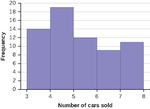
Sixty-five randomly selected car salespersons were asked the number of cars they generally sell in one week. Fourteen people answered that they generally sell three cars; nineteen generally sell four cars; twelve generally sell five cars; nine generally sell six cars; eleven generally sell seven cars. Complete the table.
| Data Value (# cars) | Frequency | Relative Frequency | Cumulative Relative Frequency |
|---|---|---|---|
What does the frequency column in [link] sum to? Why?
Solution
65
What does the relative frequency column in [link] sum to? Why?
What is the difference between relative frequency and frequency for each data value in [link]?
Solution
The relative frequency shows the proportion of data points that have each value. The frequency tells the number of data points that have each value.
What is the difference between cumulative relative frequency and relative frequency for each data value?
To construct the histogram for the data in [link], determine appropriate minimum and maximum x and y values and the scaling. Sketch the histogram. Label the horizontal and vertical axes with words. Include numerical scaling.
Solution
Answers will vary. One possible histogram is shown:
Construct a frequency polygon for the following:
-
Pulse Rates for Women Frequency 60–69 12 70–79 14 80–89 11 90–99 1 100–109 1 110–119 0 120–129 1 -
Actual Speed in a 30 MPH Zone Frequency 42–45 25 46–49 14 50–53 7 54–57 3 58–61 1 -
Tar (mg) in Nonfiltered Cigarettes Frequency 10–13 1 14–17 0 18–21 15 22–25 7 26–29 2
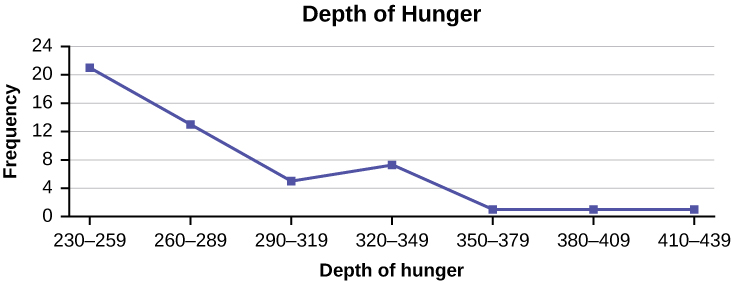
Construct a frequency polygon from the frequency distribution for the 50 highest ranked countries for depth of hunger.
| Depth of Hunger | Frequency |
|---|---|
| 230–259 | 21 |
| 260–289 | 13 |
| 290–319 | 5 |
| 320–349 | 7 |
| 350–379 | 1 |
| 380–409 | 1 |
| 410–439 | 1 |
Solution
Find the midpoint for each class. These will be graphed on the x-axis. The frequency values will be graphed on the y-axis values.
Use the two frequency tables to compare the life expectancy of men and women from 20 randomly selected countries. Include an overlaid frequency polygon and discuss the shapes of the distributions, the center, the spread, and any outliers. What can we conclude about the life expectancy of women compared to men?
| Life Expectancy at Birth – Women | Frequency |
|---|---|
| 49–55 | 3 |
| 56–62 | 3 |
| 63–69 | 1 |
| 70–76 | 3 |
| 77–83 | 8 |
| 84–90 | 2 |
| Life Expectancy at Birth – Men | Frequency |
|---|---|
| 49–55 | 3 |
| 56–62 | 3 |
| 63–69 | 1 |
| 70–76 | 1 |
| 77–83 | 7 |
| 84–90 | 5 |
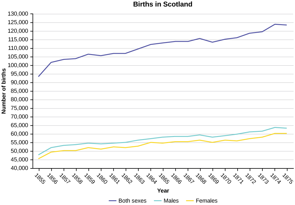
Construct a times series graph for (a) the number of male births, (b) the number of female births, and (c) the total number of births.
| Sex/Year | 1855 | 1856 | 1857 | 1858 | 1859 | 1860 | 1861 |
| Female | 45,545 | 49,582 | 50,257 | 50,324 | 51,915 | 51,220 | 52,403 |
| Male | 47,804 | 52,239 | 53,158 | 53,694 | 54,628 | 54,409 | 54,606 |
| Total | 93,349 | 101,821 | 103,415 | 104,018 | 106,543 | 105,629 | 107,009 |
| Sex/Year | 1862 | 1863 | 1864 | 1865 | 1866 | 1867 | 1868 | 1869 |
| Female | 51,812 | 53,115 | 54,959 | 54,850 | 55,307 | 55,527 | 56,292 | 55,033 |
| Male | 55,257 | 56,226 | 57,374 | 58,220 | 58,360 | 58,517 | 59,222 | 58,321 |
| Total | 107,069 | 109,341 | 112,333 | 113,070 | 113,667 | 114,044 | 115,514 | 113,354 |
| Sex/Year | 1871 | 1870 | 1872 | 1871 | 1872 | 1827 | 1874 | 1875 |
| Female | 56,099 | 56,431 | 57,472 | 56,099 | 57,472 | 58,233 | 60,109 | 60,146 |
| Male | 60,029 | 58,959 | 61,293 | 60,029 | 61,293 | 61,467 | 63,602 | 63,432 |
| Total | 116,128 | 115,390 | 118,765 | 116,128 | 118,765 | 119,700 | 123,711 | 123,578 |
Solution
The following data sets list full time police per 100,000 citizens along with homicides per 100,000 citizens for the city of Detroit, Michigan during the period from 1961 to 1973.
| Year | 1961 | 1962 | 1963 | 1964 | 1965 | 1966 | 1967 |
| Police | 260.35 | 269.8 | 272.04 | 272.96 | 272.51 | 261.34 | 268.89 |
| Homicides | 8.6 | 8.9 | 8.52 | 8.89 | 13.07 | 14.57 | 21.36 |
| Year | 1968 | 1969 | 1970 | 1971 | 1972 | 1973 |
| Police | 295.99 | 319.87 | 341.43 | 356.59 | 376.69 | 390.19 |
| Homicides | 28.03 | 31.49 | 37.39 | 46.26 | 47.24 | 52.33 |
- Construct a double time series graph using a common x-axis for both sets of data.
- Which variable increased the fastest? Explain.
- Did Detroit’s increase in police officers have an impact on the murder rate? Explain.
Chapter Review from 2.3
The values that divide a rank-ordered set of data into 100 equal parts are called percentiles. Percentiles are used to compare and interpret data. For example, an observation at the 50th percentile would be greater than 50 percent of the other observations in the set. Quartiles divide data into quarters. The first quartile (Q1) is the 25th percentile, the second quartile (Q2 or median) is 50th percentile, and the third quartile (Q3) is the 75th percentile. The interquartile range, or IQR, is the range of the middle 50 percent of the data values. The IQR is found by subtracting Q1 from Q3, and can help determine outliers by using the following two expressions.
- Q3 + IQR(1.5)
- Q1 – IQR(1.5)
Formula Review
[latex]i=\left(\frac{k}{100}\right)\left(n+1\right)[/latex]
where i = the ranking or position of a data value,
k = the kth percentile,
n = total number of data.
Expression for finding the percentile of a data value: [latex]\left(\frac{x\text{ + }0.5y}{n}\right)[/latex](100)
where x = the number of values counting from the bottom of the data list up to but not including the data value for which you want to find the percentile,
y = the number of data values equal to the data value for which you want to find the percentile,
n = total number of data
Listed are 29 ages for Academy Award winning best actors in order from smallest to largest.
18; 21; 22; 25; 26; 27; 29; 30; 31; 33; 36; 37; 41; 42; 47; 52; 55; 57; 58; 62; 64; 67; 69; 71; 72; 73; 74; 76; 77
- Find the 40th percentile.
- Find the 78th percentile.
Solution
- The 40th percentile is 37 years.
- The 78th percentile is 70 years.
Listed are 32 ages for Academy Award winning best actors in order from smallest to largest.
18; 18; 21; 22; 25; 26; 27; 29; 30; 31; 31; 33; 36; 37; 37; 41; 42; 47; 52; 55; 57; 58; 62; 64; 67; 69; 71; 72; 73; 74; 76; 77
- Find the percentile of 37.
- Find the percentile of 72.
Jesse was ranked 37th in his graduating class of 180 students. At what percentile is Jesse’s ranking?
Solution
Jesse graduated 37th out of a class of 180 students. There are 180 – 37 = 143 students ranked below Jesse. There is one rank of 37.
x = 143 and y = 1. [latex]\frac{x+0.5y}{n}[/latex](100) = [latex]\frac{143+0.5\left(1\right)}{180}[/latex](100) = 79.72. Jesse’s rank of 37 puts him at the 80th percentile.
- For runners in a race, a low time means a faster run. The winners in a race have the shortest running times. Is it more desirable to have a finish time with a high or a low percentile when running a race?
- The 20th percentile of run times in a particular race is 5.2 minutes. Write a sentence interpreting the 20th percentile in the context of the situation.
- A bicyclist in the 90th percentile of a bicycle race completed the race in 1 hour and 12 minutes. Is he among the fastest or slowest cyclists in the race? Write a sentence interpreting the 90th percentile in the context of the situation.
- For runners in a race, a higher speed means a faster run. Is it more desirable to have a speed with a high or a low percentile when running a race?
- The 40th percentile of speeds in a particular race is 7.5 miles per hour. Write a sentence interpreting the 40th percentile in the context of the situation.
Solution
- For runners in a race it is more desirable to have a high percentile for speed. A high percentile means a higher speed which is faster.
- 40% of runners ran at speeds of 7.5 miles per hour or less (slower). 60% of runners ran at speeds of 7.5 miles per hour or more (faster).
On an exam, would it be more desirable to earn a grade with a high or low percentile? Explain.
Mina is waiting in line at the Department of Motor Vehicles (DMV). Her wait time of 32 minutes is the 85th percentile of wait times. Is that good or bad? Write a sentence interpreting the 85th percentile in the context of this situation.
Solution
When waiting in line at the DMV, the 85th percentile would be a long wait time compared to the other people waiting. 85% of people had shorter wait times than Mina. In this context, Mina would prefer a wait time corresponding to a lower percentile. 85% of people at the DMV waited 32 minutes or less. 15% of people at the DMV waited 32 minutes or longer.
In a survey collecting data about the salaries earned by recent college graduates, Li found that her salary was in the 78th percentile. Should Li be pleased or upset by this result? Explain.
In a study collecting data about the repair costs of damage to automobiles in a certain type of crash tests, a certain model of car had 💲1,700 in damage and was in the 90th percentile. Should the manufacturer and the consumer be pleased or upset by this result? Explain and write a sentence that interprets the 90th percentile in the context of this problem.
Solution
The manufacturer and the consumer would be upset. This is a large repair cost for the damages, compared to the other cars in the sample. INTERPRETATION: 90% of the crash tested cars had damage repair costs of 💲1700 or less; only 10% had damage repair costs of 💲1700 or more.
The University of California has two criteria used to set admission standards for freshman to be admitted to a college in the UC system:
- Students’ GPAs and scores on standardized tests (SATs and ACTs) are entered into a formula that calculates an “admissions index” score. The admissions index score is used to set eligibility standards intended to meet the goal of admitting the top 12% of high school students in the state. In this context, what percentile does the top 12% represent?
- Students whose GPAs are at or above the 96th percentile of all students at their high school are eligible (called eligible in the local context), even if they are not in the top 12% of all students in the state. What percentage of students from each high school are “eligible in the local context”?
Suppose that you are buying a house. You and your realtor have determined that the most expensive house you can afford is the 34th percentile. The 34th percentile of housing prices is 💲240,000 in the town you want to move to. In this town, can you afford 34% of the houses or 66% of the houses?
Solution
You can afford 34% of houses. 66% of the houses are too expensive for your budget. INTERPRETATION: 34% of houses cost 💲240,000 or less. 66% of houses cost 💲240,000 or more.
Use [link] to calculate the following values:
First quartile = _______
Second quartile = median = 50th percentile = _______
Solution
4
Third quartile = _______
Interquartile range (IQR) = _____ – _____ = _____
Solution
6 – 4 = 2
10th percentile = _______
70th percentile = _______
Solution
6
Chapter Review from 2.4
Box plots are a type of graph that can help visually organize data. To graph a box plot the following data points must be calculated: the minimum value, the first quartile, the median, the third quartile, and the maximum value. Once the box plot is graphed, you can display and compare distributions of data.
Sixty-five randomly selected car salespersons were asked the number of cars they generally sell in one week. Fourteen people answered that they generally sell three cars; nineteen generally sell four cars; twelve generally sell five cars; nine generally sell six cars; eleven generally sell seven cars.
Construct a box plot below. Use a ruler to measure and scale accurately.
Looking at your box plot, does it appear that the data are concentrated together, spread out evenly, or concentrated in some areas, but not in others? How can you tell?
Solution
More than 25% of salespersons sell four cars in a typical week. You can see this concentration in the box plot because the first quartile is equal to the median. The top 25% and the bottom 25% are spread out evenly; the whiskers have the same length.
Chapter Review from 2.5
The mean and the median can be calculated to help you find the “center” of a data set. The mean is the best estimate for the actual data set, but the median is the best measurement when a data set contains several outliers or extreme values. The mode will tell you the most frequently occurring datum (or data) in your data set. The mean, median, and mode are extremely helpful when you need to analyze your data, but if your data set consists of ranges which lack specific values, the mean may seem impossible to calculate. However, the mean can be approximated if you add the lower boundary with the upper boundary and divide by two to find the midpoint of each interval. Multiply each midpoint by the number of values found in the corresponding range. Divide the sum of these values by the total number of data values in the set.
Formula Review
[latex]\mu =\frac{\sum fm}{\sum f}[/latex] Where f = interval frequencies and m = interval midpoints.
Find the mean for the following frequency tables.
-
Grade Frequency 49.5–59.5 2 59.5–69.5 3 69.5–79.5 8 79.5–89.5 12 89.5–99.5 5 -
Daily Low Temperature Frequency 49.5–59.5 53 59.5–69.5 32 69.5–79.5 15 79.5–89.5 1 89.5–99.5 0 -
Points per Game Frequency 49.5–59.5 14 59.5–69.5 32 69.5–79.5 15 79.5–89.5 23 89.5–99.5 2
Use the following information to answer the next three exercises: The following data show the lengths of boats moored in a marina. The data are ordered from smallest to largest:
161719202021232425252526262727272829303233333435373940
Calculate the mean.
Solution
Mean: 16 + 17 + 19 + 20 + 20 + 21 + 23 + 24 + 25 + 25 + 25 + 26 + 26 + 27 + 27 + 27 + 28 + 29 + 30 + 32 + 33 + 33 + 34 + 35 + 37 + 39 + 40 = 738;
[latex]\frac{738}{27}[/latex] = 27.33
Identify the median.
Identify the mode.
Solution
The most frequent lengths are 25 and 27, which occur three times. Mode = 25, 27
Use the following information to answer the next three exercises: Sixty-five randomly selected car salespersons were asked the number of cars they generally sell in one week. Fourteen people answered that they generally sell three cars; nineteen generally sell four cars; twelve generally sell five cars; nine generally sell six cars; eleven generally sell seven cars. Calculate the following:
sample mean = [latex]\overline{x}[/latex] = _______
median = _______
Solution
4
mode = _______
Chapter Review from 2.6
Looking at the distribution of data can reveal a lot about the relationship between the mean, the median, and the mode. There are three types of distributions. A right (or positive) skewed distribution has a shape like [link]. A left (or negative) skewed distribution has a shape like [link]. A symmetrical distribution looks like [link].
Use the following information to answer the next three exercises: State whether the data are symmetrical, skewed to the left, or skewed to the right.
11122223333333344455
Solution
The data are symmetrical. The median is 3 and the mean is 2.85. They are close, and the mode lies close to the middle of the data, so the data are symmetrical.
161719222222222223
87878787878889899091
Solution
The data are skewed right. The median is 87.5 and the mean is 88.2. Even though they are close, the mode lies to the left of the middle of the data, and there are many more instances of 87 than any other number, so the data are skewed right.
When the data are skewed left, what is the typical relationship between the mean and median?
When the data are symmetrical, what is the typical relationship between the mean and median?
Solution
When the data are symmetrical, the mean and median are close or the same.
What word describes a distribution that has two modes?
Describe the shape of this distribution.
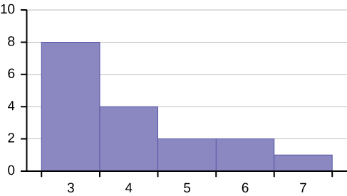
Solution
The distribution is skewed right because it looks pulled out to the right.
Describe the relationship between the mode and the median of this distribution.
Describe the relationship between the mean and the median of this distribution.
Solution
The mean is 4.1 and is slightly greater than the median, which is four.
Describe the shape of this distribution.
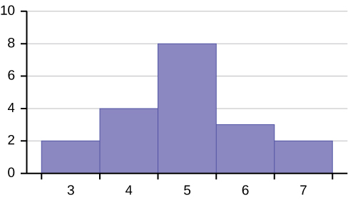
Describe the relationship between the mode and the median of this distribution.
Solution
The mode and the median are the same. In this case, they are both five.
Are the mean and the median the exact same in this distribution? Why or why not?
Describe the shape of this distribution.
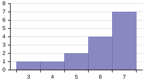
Solution
The distribution is skewed left because it looks pulled out to the left.
Describe the relationship between the mode and the median of this distribution.
Describe the relationship between the mean and the median of this distribution.
Solution
The mean and the median are both six.
The mean and median for the data are the same.
345566667777777
Is the data perfectly symmetrical? Why or why not?
Which is the greatest, the mean, the mode, or the median of the data set?
111112121212131517222222
Solution
The mode is 12, the median is 13.5, and the mean is 15.1. The mean is the largest.
Which is the least, the mean, the mode, and the median of the data set?
5656565859606264646567
Of the three measures, which tends to reflect skewing the most, the mean, the mode, or the median? Why?
Solution
The mean tends to reflect skewing the most because it is affected the most by outliers.
In a perfectly symmetrical distribution, when would the mode be different from the mean and median?
Chapter Review from 2.7
The standard deviation can help you calculate the spread of data. There are different equations to use if you are calculating the standard deviation of a sample or of a population.
- The Standard Deviation allows us to compare individual data or classes to the data set mean numerically.
- s = [latex]\sqrt{\frac{{\sum }^{\text{}}{\left(x-\overline{x}\right)}^{2}}{n-1}}[/latex] or s = [latex]\sqrt{\frac{{\sum }^{\text{}}f{\left(x-\overline{x}\right)}^{2}}{n-1}}[/latex] is the formula for calculating the standard deviation of a sample. To calculate the standard deviation of a population, we would use the population mean, μ, and the formula σ = [latex]\sqrt{\frac{{\sum }^{\text{}}{\left(x-\mu \right)}^{2}}{N}}[/latex] or σ = [latex]\sqrt{\frac{{\sum }^{\text{}}f{\left(x-\mu \right)}^{2}}{N}}[/latex].
Formula Review
[latex]{s}_{x}=\sqrt{\frac{\sum f{m}^{2}}{n}-{\overline{x}}^{2}}[/latex] where [latex]\begin{array}{l}{s}_{x}=\text{ sample standard deviation}\\ \overline{x}\text{ = sample mean}\end{array}[/latex]
Use the following information to answer the next two exercises: The following data are the distances between 20 retail stores and a large distribution center. The distances are in miles.
29; 37; 38; 40; 58; 67; 68; 69; 76; 86; 87; 95; 96; 96; 99; 106; 112; 127; 145; 150
Use a graphing calculator or computer to find the standard deviation and round to the nearest tenth.
Solution
s = 34.5
Find the value that is one standard deviation below the mean.
Two baseball players, Fredo and Karl, on different teams wanted to find out who had the higher batting average when compared to his team. Which baseball player had the higher batting average when compared to his team?
| Baseball Player | Batting Average | Team Batting Average | Team Standard Deviation |
|---|---|---|---|
| Fredo | 0.158 | 0.166 | 0.012 |
| Karl | 0.177 | 0.189 | 0.015 |
Solution
For Fredo: z = [latex]\frac{0.158\text{ – }0.166}{0.012}[/latex]
= –0.67
For Karl: z = [latex]\frac{0.177\text{ – }0.189}{0.015}[/latex]
= –0.8
Fredo’s z-score of –0.67 is higher than Karl’s z-score of –0.8. For batting average, higher values are better, so Fredo has a better batting average compared to his team.
Use [link] to find the value that is three standard deviations:
- above the mean
- below the mean
Find the standard deviation for the following frequency tables using the formula. Check the calculations with the TI 83/84.
Find the standard deviation for the following frequency tables using the formula. Check the calculations with the TI 83/84.
-
Grade Frequency 49.5–59.5 2 59.5–69.5 3 69.5–79.5 8 79.5–89.5 12 89.5–99.5 5 -
Daily Low Temperature Frequency 49.5–59.5 53 59.5–69.5 32 69.5–79.5 15 79.5–89.5 1 89.5–99.5 0 -
Points per Game Frequency 49.5–59.5 14 59.5–69.5 32 69.5–79.5 15 79.5–89.5 23 89.5–99.5 2
Solution
- [latex]{s}_{x}=\sqrt{\frac{\sum f{m}^{2}}{n}-{\overline{x}}^{2}}=\sqrt{\frac{193157.45}{30}-{79.5}^{2}}=10.88[/latex]
- [latex]{s}_{x}=\sqrt{\frac{\sum f{m}^{2}}{n}-{\overline{x}}^{2}}=\sqrt{\frac{380945.3}{101}-{60.94}^{2}}=7.62[/latex]
- [latex]{s}_{x}=\sqrt{\frac{\sum f{m}^{2}}{n}-{\overline{x}}^{2}}=\sqrt{\frac{440051.5}{86}-{70.66}^{2}}=11.14[/latex]
